Your website is often the first hello your business gives to potential clients.
But if that hello feels confusing, slow, or cluttered — people simply leave.
For pet hospitals, groomers, horse farms, and relocation services, your site isn’t just digital real estate. It’s an emotional bridge between care and conversion.
Here are three common pet business website mistakes that quietly push visitors away — and how to fix them before they cost you clients.

1. Cluttered Design → Trust Drops
Too many colors, fonts, or elements can make your site feel chaotic.
And chaos doesn’t translate to care — it sends a signal of disorganization and lack of professionalism.
Fix it:
Simplify your color palette and stick to consistent typography.
Use whitespace to help your content breathe and let your visuals shine.
Read next: Pet Color Palette: Building Trust Through Design
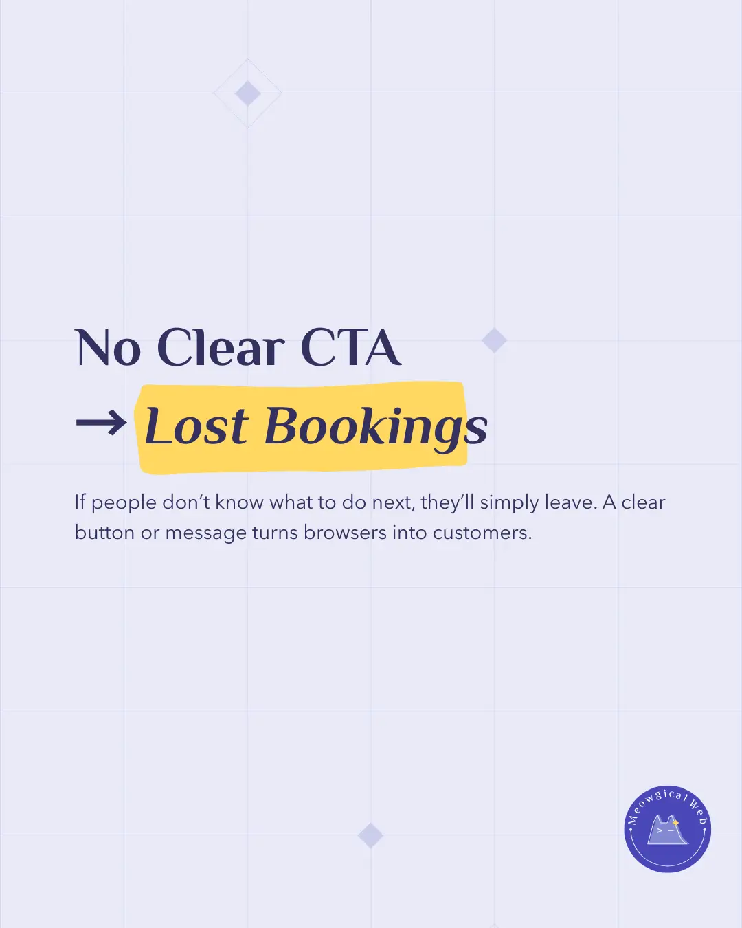
2. No Clear CTA → Lost Bookings
If your visitors can’t tell what to do next, they’ll quietly leave.
A confusing layout or missing “Book Now” button makes it harder for clients to take action.
Fix it:
Guide users with clear, friendly CTAs: “Schedule a Visit,” “Book Grooming,” or “Call Us Today.”
Every page should have a single, simple goal.
Pro tip: A clear CTA can increase conversions by up to 45%, according to HubSpot’s Web Conversion Study.
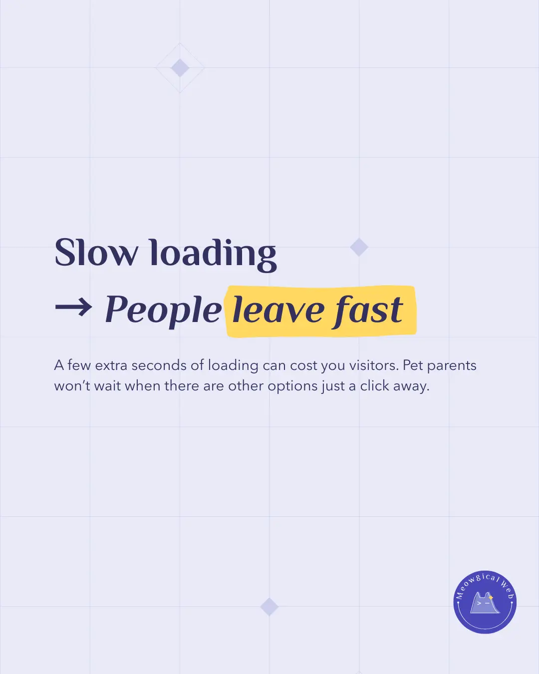
3. Slow Loading → People Leave Fast
A few extra seconds of loading can make a huge difference.
Pet parents — especially those booking urgent care — won’t wait around.
Fix it:
Compress your images, use modern hosting, and test your speed regularly on Google PageSpeed Insights.
Fast sites build credibility and show that you value your customers’ time.
Final Thought
Small website mistakes often lead to big client losses — but they’re easy to fix once you know what to look for.
When your pet business website feels clear, caring, and fast, you’re not just improving SEO — you’re building trust. Because in the pet world, trust is everything!