Ever wonder why your competitor’s website just feels more trustworthy? You might think it’s their photos. Or their copy. However, it could be something simpler.
Their colors.
Most pet business owners pick colors they personally like. Blue because it’s your favorite. Green to match your logo. Purple because it looks nice. That’s a mistake.
Your website colors aren’t about what you like. Instead, they’re about what makes anxious pet parents feel safe enough to book.
Colors Change How Pet Owners Feel About You
Pet parents visit your website feeling anxious. Their dog needs grooming. Additionally, their cat needs a vet. Their senior pet needs boarding. Consequently, they’re looking for someone they can trust.
Your website colors either calm that anxiety or make it worse. Therefore, choosing the right colors matters more than most pet businesses realize.
Think about it this way. You walk into a veterinary clinic painted entirely in bright red and black. How would you feel? Probably stressed, right? Meanwhile, a clinic with soft blue walls feels completely different. More calming. In fact, more trustworthy.
Your website works the same way. Related post: Why Every Strong Pet Website Starts With a Moodboard
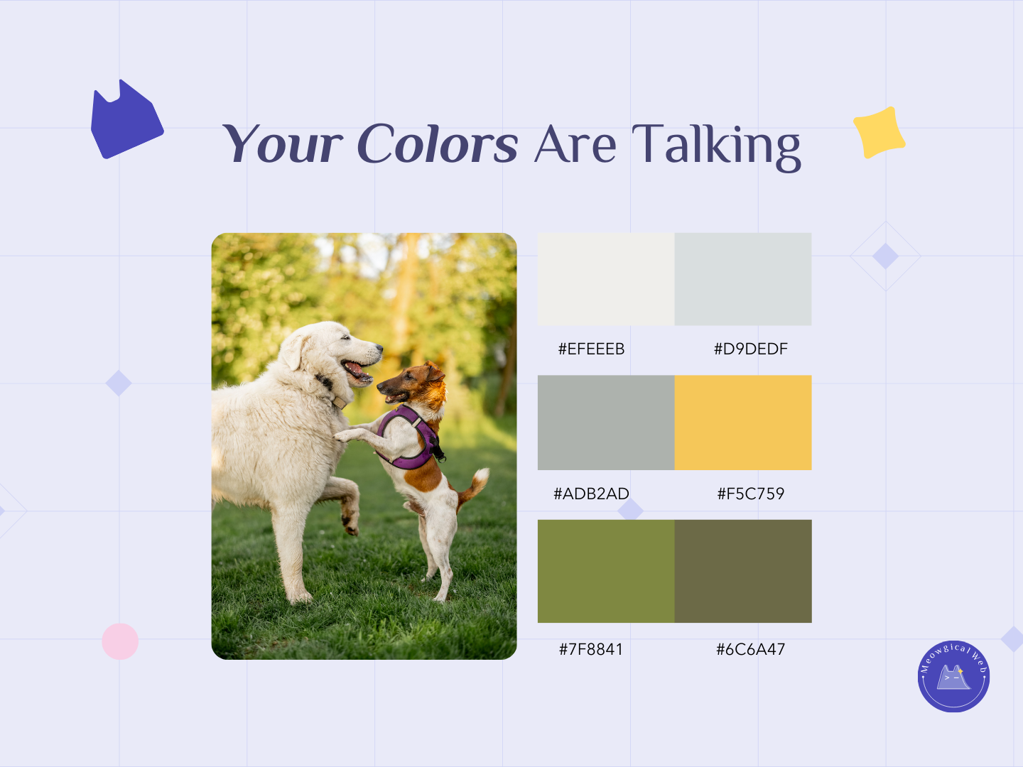
The Colors That Build Trust
Blue is the trust color. Research shows it actually lowers blood pressure. It slows heart rate. Consequently, people feel safer when they see blue. Banks use it. Hospitals use it. Similarly, pet businesses should use it too.
Green connects to nature and health. It feels organic. Additionally, it feels healing. Green reminds people of outdoor spaces where pets play. Furthermore, veterinary clinics particularly benefit from green tones.
Soft purple combines calm with warmth. It suggests gentleness. Moreover, it suggests care. Purple works beautifully for businesses serving senior pets. Also great for special needs animals.
Warm neutrals like beige and tan feel clean. They feel professional. However, they don’t feel cold or sterile. Instead, these colors create the perfect background for your content.
The Colors That Create Problems
Red grabs attention powerfully. However, it also increases heart rate. Creates urgency. In small doses? Effective for “Book Now” buttons. As your main color covering the whole site? Then it makes anxious pet parents even more anxious.
Black looks sophisticated. It looks premium. Nevertheless, too much black feels heavy. It feels cold. Pet services need warmth, not coldness. Therefore, heavy black backgrounds usually work against you.
Bright orange and neon colors feel energetic. They feel exciting. However, they can overwhelm people who need reassurance. Instead, use them sparingly if at all.
According to color psychology research, calming colors keep people on websites 40% longer. In comparison, aggressive colors drive people away.
The Smart Color Strategy
Start with a calming base color. Choose blue, green, soft purple, or warm neutrals. This creates an emotional foundation. Additionally, it tells visitors “you can relax here.”
Then add pops of bold color strategically. Your booking button can be bright. Your phone number can stand out. Furthermore, important calls-to-action benefit from contrast.
For example, imagine a pet grooming website. The main background is soft blue. The text sits on warm beige sections. Meanwhile, the “Book Appointment” button is vibrant orange. Visitors feel calm browsing. Additionally, they can easily find the booking option.
This approach gives you both benefits. Calm feelings plus clear actions.
Test Your Current Colors Right Now
Open your website on your phone. Look at it with fresh eyes. What feeling hits you first? Calm or stress? Trust or uncertainty?
Better yet, show it to a friend. Ask them what emotions they feel. Don’t explain anything. Instead, just watch their reaction.