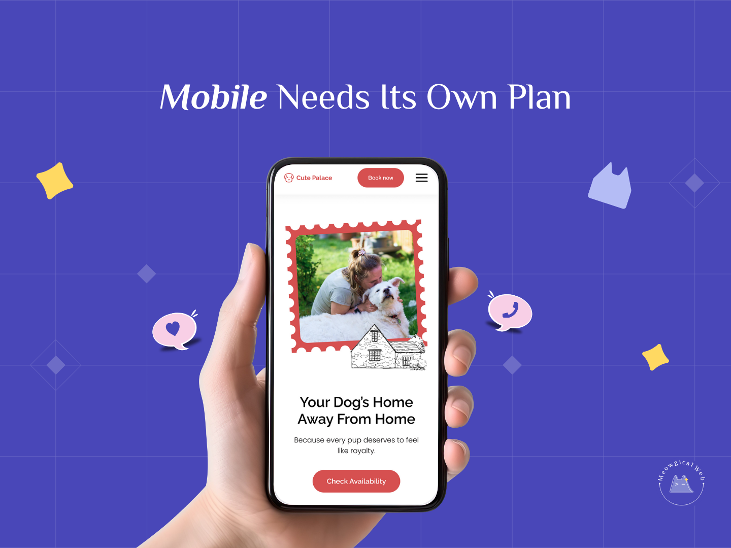
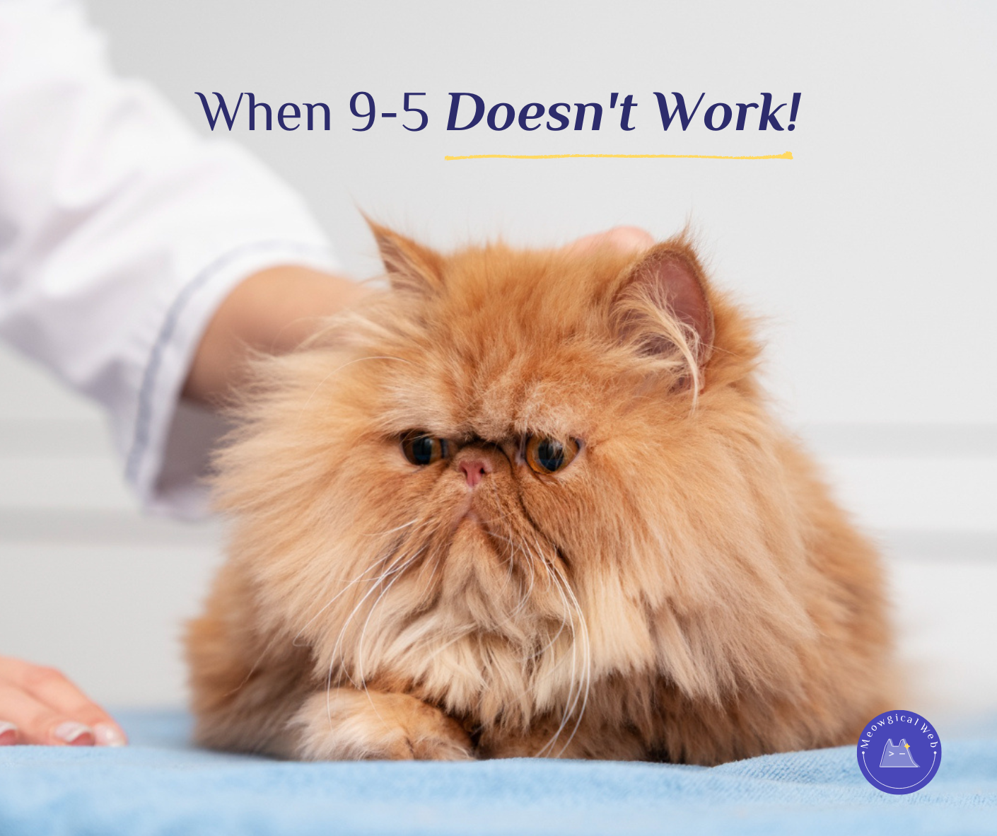
A strong mobile layout does more than shrink your desktop site. It creates a smoother path that helps pet parents decide with less effort. Because of that, mobile design needs its own plan, its own spacing, and its own rhythm.
Most pet owners browse on the go. They scroll while walking, waiting, or relaxing with their pets. So their attention shifts fast. As a result, your mobile site must feel clear, calm, and easy from the very first tap.
1. Why mobile needs its own structure
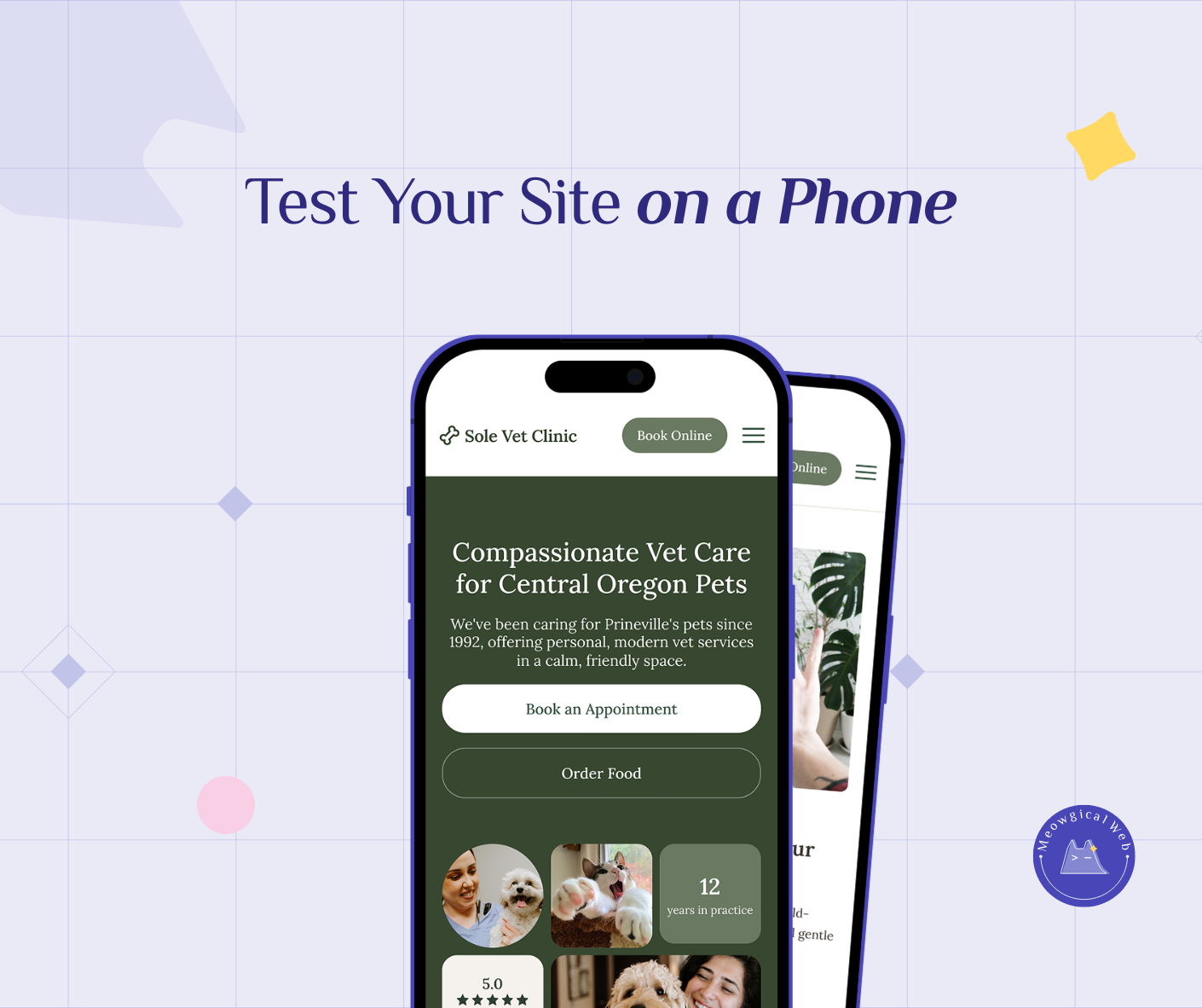
Mobile users skim. They scroll quickly. Therefore, each section must support fast reading. Short lines help them stay focused. Clear breaks guide their eyes. Simple actions reduce friction. When the structure feels light, people stay longer.
If you want to explore how people behave on mobile, here is a helpful internal guide: The Proven Benefits of Mobile-First Design for Pet Businesses
2. How good mobile design supports action
A thoughtful mobile layout reduces effort. First, larger tap areas help tired thumbs. Next, shorter text blocks support quick reading. After that, clear spacing guides the scroll. Because of this, the call to action feels easy to reach.
For more insight on mobile flow, this resource explains the psychology of mobile comfort: Responsive Web Design (RWD) and User Experience
3. Why smooth mobile design builds trust
Pretty visuals catch attention. However, smooth mobile design keeps attention. When the site feels calm, visitors relax. They sense care behind each detail. Consequently, that comfort becomes trust and trust becomes action.
At Meowgical Web, we design mobile experiences that feel warm, simple, and reliable. And because of that, pet parents engage more naturally.
If you want to learn how emotion shapes decisions, you can explore this link: Why a Comfortable Website Wins More Loyal Pet Parents Quickly
Final Thought
Mobile design is not a copy of desktop design. It is its own experience. When your mobile layout supports the way people scroll, tap, and decide, every visit feels easier. And when things feel easier, pet parents trust you faster.
If you want your mobile layout to feel smoother and more comfortable, we can help.
Let’s design something Meowgical together.
Book your free consultation →