Your navigation menu has 12 options. That’s about 11 too many, honestly.
We see this constantly with pet business websites. The menu looks something like: Home | About | Services | Dog Grooming | Cat Grooming | Boarding | Daycare | Training | Testimonials | Blog | FAQ | Gallery | Contact | Events | Careers…
And it just keeps going. That’s not navigation – that’s overwhelming people who just want to find a groomer for their anxious poodle.
Why This Actually Matters
Think about who’s visiting your website. Someone’s stressed because their dog needs emergency boarding. Or they’re researching vets for their new kitten. Maybe they’re frantically looking for a groomer who can handle matted fur. Additionally, they’re probably doing this on their phone while juggling other things.
Do they want to decode a complex menu with 15 options? Absolutely not. They want to find what they need in about 3 seconds and move on with their life. Furthermore, every extra menu item adds another decision they have to make.
According to Nielsen Norman Group research, navigation menus with more than 7 items significantly increase cognitive load and reduce user satisfaction. Moreover, people simply give up and leave when navigation feels complicated.
Similar to how your website has just 2.5 seconds to make a good impression, your navigation needs to work instantly. Confusing menus break that crucial first impression immediately.
What Actually Works
Keep your main navigation to 5-7 items maximum. That’s it. Seriously, count your current menu items right now – we’ll bet you have way more than that.
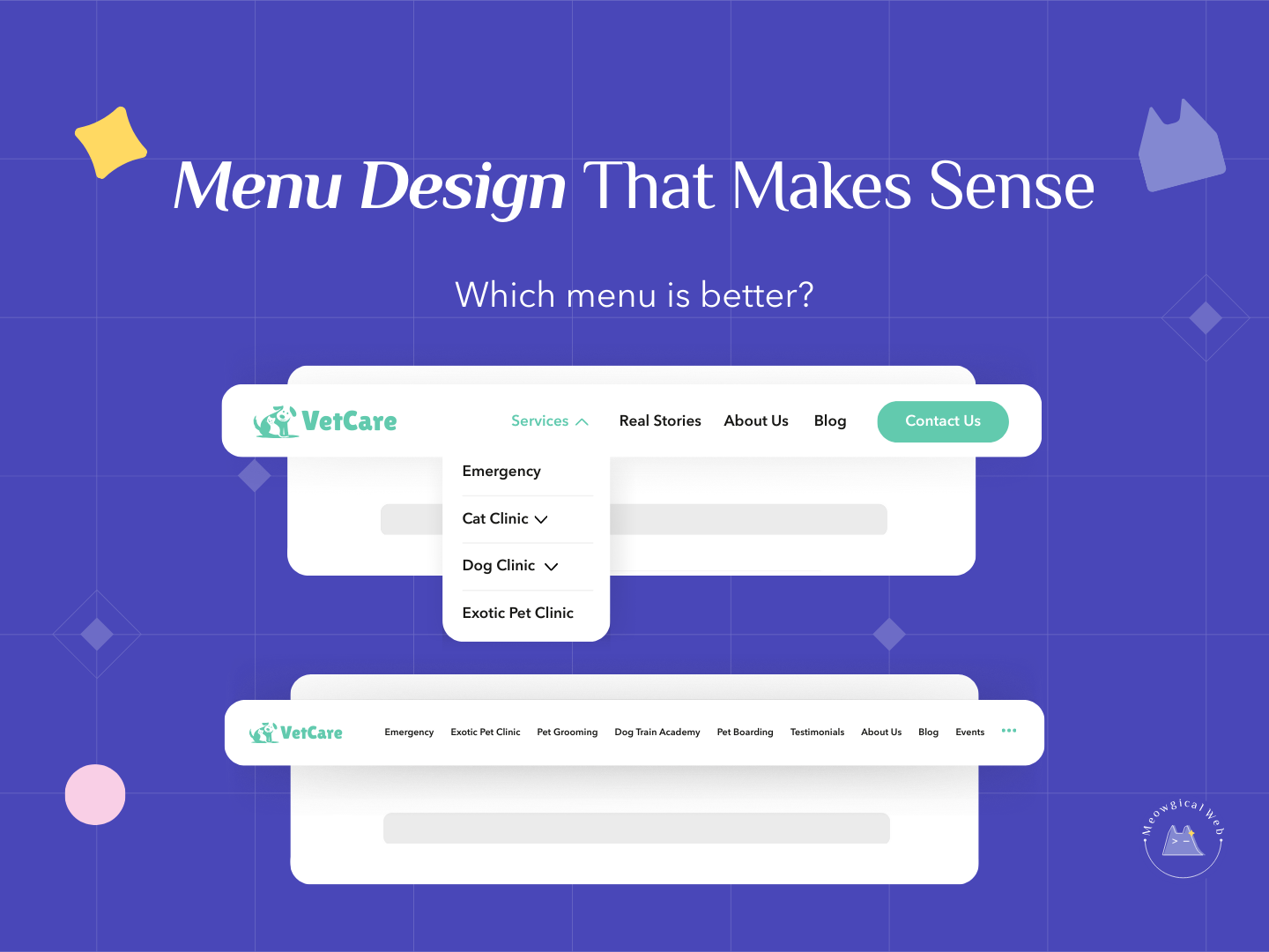
Group related services under a “Services” dropdown. Instead of listing Dog Grooming, Cat Grooming, Nail Trims, De-Shedding Treatments, and Specialty Baths separately, just have one “Services” menu item that drops down to show everything. Consequently, your main menu stays clean while people can still find specific offerings.
Make “Book Now” or “Schedule Appointment” a visually distinct button. Not just another text link buried in your menu. A actual button in a contrasting color that catches attention immediately. Therefore, your most important action stands out.
Keep your menu consistent across every single page. Don’t have different navigation on your homepage versus service pages. Consistency helps people feel oriented. Additionally, it reduces confusion as they click around your site.
The Classic Mistakes
Many pet businesses try to fit their entire sitemap into the main menu. Everything they offer, every page they have, all crammed up there. The thinking seems to be “if we don’t put it in the menu, people won’t find it.” However, that’s backwards – burying things among 15 other options means people definitely won’t find it.
Others create confusing category names that don’t match what people actually search for. “Pet Wellness Services” sounds fancy, but people are searching for “vet” or “veterinary clinic.” Therefore, use words people actually use, not internal jargon.
Some sites have mega-menus that take over the entire screen when you hover. Multiple columns, dozens of sub-items, basically a full sitemap dropdown. These might work for huge e-commerce sites, but they’re overkill for a local pet grooming business. Moreover, they’re terrible on mobile devices.
Several pet businesses forget about mobile entirely. Their desktop menu might be okay, but on phones it becomes an endless scrolling list. Since most people visit on mobile, this is a massive problem.
How to Simplify Your Menu
Start by listing everything currently in your menu. Write it all down. Now ask yourself – what do most visitors actually need to find? Probably services, contact info, booking, and maybe about/reviews. That’s your core menu right there.
Take all your specific services and group them. “Dog Services” with a dropdown for grooming, daycare, training. “Cat Services” with a dropdown for grooming, boarding, vet care. Or just one “Services” dropdown with everything. Consequently, you’ve turned 8 menu items into 1 or 2.
Move less critical items to your footer. Things like Careers, Privacy Policy, Testimonials, Blog, FAQ – these don’t need to be in your main navigation. People who want them will find them in the footer. Therefore, your main menu stays focused on what matters most.
Make your booking action obvious and different. If “Book Now” looks exactly like “About Us” in your menu, it doesn’t stand out. Use a button style with contrasting color. Additionally, consider putting it in multiple places – both the menu and as a floating button that follows people down the page.
Test your navigation on your phone right now. Can you easily tap what you need? Does the menu take forever to expand? Are you scrolling through 20 items trying to find services? If yes, it needs simplification.
The Psychology Behind Simple Menus
When people see too many options, they freeze. This is called decision paralysis. Instead of picking one option, they pick none and leave. Therefore, limiting choices actually increases the chances people take action.
Simple navigation reduces anxiety. Someone visiting your site is already stressed about their pet. Complex menus add more stress. However, clean navigation that works instantly removes one barrier. Consequently, they feel more confident about booking.
Clear menus build trust immediately. If you can’t organize your website simply, pet parents wonder if you can organize their pet’s care competently. Sounds harsh, but first impressions matter enormously.
What Your Menu Should Look Like
Here’s a solid structure for most pet businesses: Home | Services (dropdown) | About | Reviews | Blog | Contact | [Book Now Button]
That’s 7 items total, with one being a dropdown and one being an action button. Clean, clear, and everything people need is accessible within one click. Moreover, it works perfectly on both desktop and mobile.
For veterinary clinics: Home | Services (dropdown) | Emergency Care | New Clients | Contact | [Schedule Appointment Button]
For boarding facilities: Home | Boarding | Daycare | Gallery | FAQ | Contact | [Book Stay Button]
Notice how each version prioritizes what that specific business type needs most. Additionally, none exceed 7 items total.
Making Changes Today
Open your website and count your main menu items. If you have more than 7, it’s time to simplify. List what you have, then group related items together.
Create service dropdowns to consolidate offerings. Test that they work on mobile devices. Make sure people can actually tap and see the dropdown options easily.
Turn your booking link into a distinct button. Different color, slight size increase, maybe even an icon. Something that visually says “this is the most important action here.”
Ask someone unfamiliar with your business to find three things on your site: your services, how to book, and your phone number. If they struggle with any of these, your navigation needs work.
Your navigation should be invisible in the best way possible. People shouldn’t notice it because it just works effortlessly. Therefore, simplicity isn’t about being minimal – it’s about being helpful without adding cognitive load.
How many items are in your main menu right now? Time to count and simplify!