A good website doesn’t need to shout — it just needs to speak clearly.
When people visit your page, they shouldn’t have to figure out who you are or what you offer. Instead, they should instantly feel:
– What you do
– Who it’s for
– Why they can trust you
In today’s noisy digital world, simplicity is power. Because when your website feels calm and clear, visitors relax and trust begins.
1. Clarity Builds Confidence
Imagine walking into a pet store where everything is neatly labeled, calm, and welcoming. You instantly feel at ease.
That’s exactly how your website should feel.
When your homepage clearly communicates your services, location, and values, visitors know they’re in the right place.
Pro tip: Your first 5 seconds decide if someone stays or leaves.
Keep your header simple — “Happy Pets, Honest Care” says more than “Innovative, Professional, Customized Solutions.”
Related: 3 Reasons Why Pet Businesses Need Warm and Honest Websites
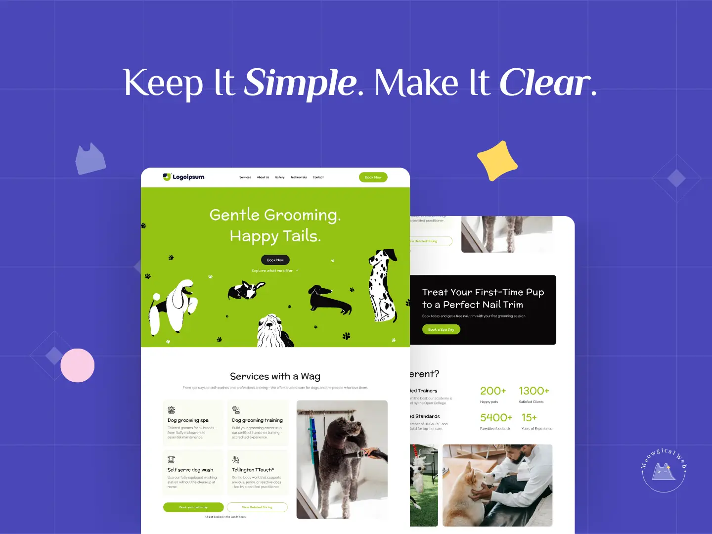
2. Simple Design, Strong Results
Complex design might look impressive, but it rarely connects.
In contrast, the most effective pet websites are clean, intuitive, and emotionally balanced.
Here’s what simplicity looks like:
- Real photos instead of stock images
- Easy booking buttons visible on every page
- Short, friendly copy that sounds human
- Consistent colors and fonts (no visual chaos!)
Moreover, flashy animations can distract visitors, while clarity keeps their attention focused on what truly matters — you.
As a result, simple layouts often outperform “fancy” ones in both conversions and engagement.
Rule of paw: If a 10-year-old can understand your homepage in under 10 seconds, you’re doing great.
3. Speak to Humans (and Their Pets)
Your visitors aren’t just clients, they’re pet parents.
Therefore, they respond best to empathy, not jargon.
When you say, “We treat every pet like family,” people feel it.
When you say, “We provide exceptional animal care services using advanced methodologies,” they don’t.
Because emotional clarity creates connection, your words should sound like a conversation, not a corporate statement.
For example, instead of “Our team offers multiple grooming packages,” try “Let’s make your pup’s first groom a happy memory.”
For a deeper dive, read: Pet Branding That Works: Why Feelings Convert Better Than Features
4. Why Clarity Converts
Simplicity doesn’t just look beautiful — it works beautifully.
According to Nielsen Norman Group, users stay longer and trust more on websites that are easy to read and navigate.
In fact, when visitors don’t need to think hard, they feel safe — and that safety leads to sales.
On the other hand, when a site is cluttered or confusing, they leave fast.
As a result, clarity becomes one of your strongest competitive advantages.
Final Thought
At Meowgical Web, we believe that simple isn’t boring — it’s brilliant.
Because when design gets out of the way, your story shines through.
Ultimately, clear design reflects clear care — and that’s what every pet parent values most.
We help pet businesses create websites that work smarter — not louder.
What’s one thing you wish your website did better right now?
We’d love to help you make it happen — clearly and Meowgically.