Color is more than decoration. In fact, it’s one of the fastest ways pet parents form an impression of your brand. Because people feel before they think, your palette quietly shapes trust. As a result, color influences how visitors interpret your tone and whether they stay long enough to book.
When used well, color becomes a powerful emotional tool. However, when it’s used without intention, it can create confusion, inconsistency, and a loss of credibility.
This guide will walk you through choosing colors that feel warm, safe, and professional. Moreover, these choices help your website reflect the same care you bring to your daily work. If you’d like more context, you can also read our post 3 Reasons Why Pet Businesses Need Warm and Honest Websites, which explains the emotional layer behind design decisions.
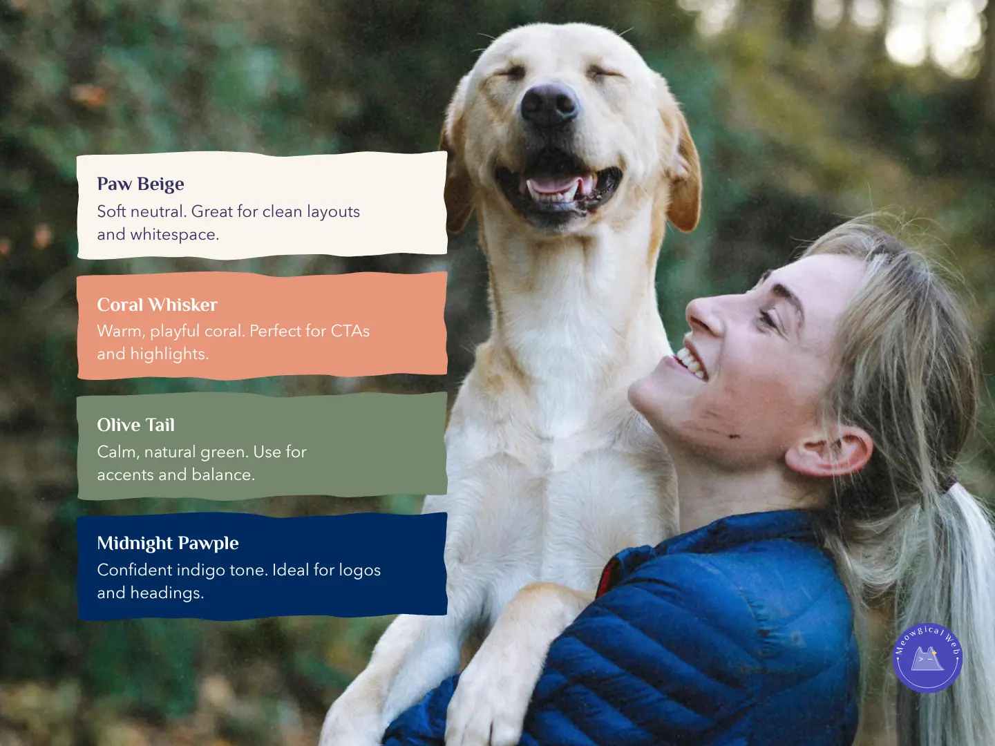
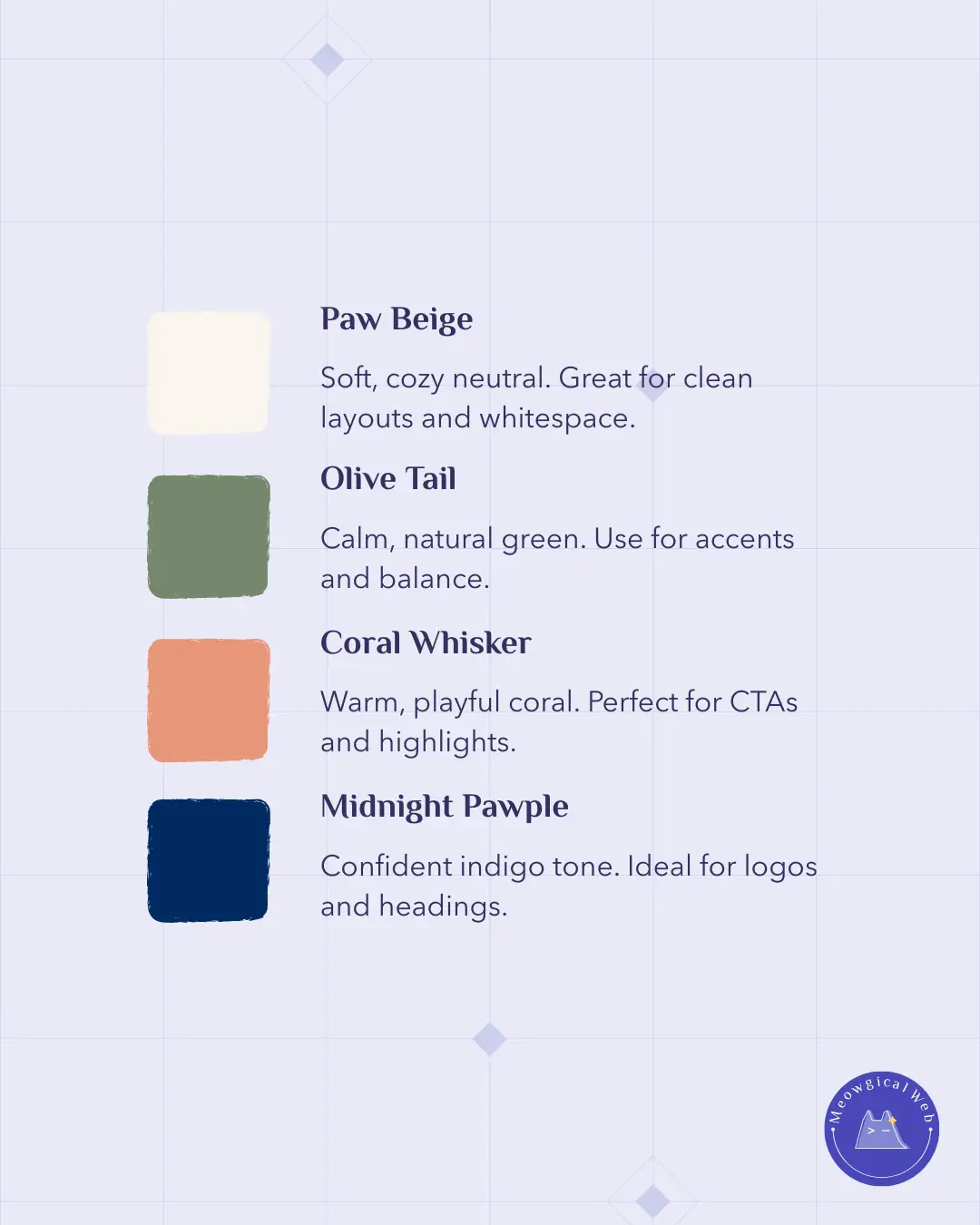
1. Paw Beige – The Foundation of Calm
Paw Beige is soft, cozy, and timeless. Because of this, it works as a grounding neutral that creates space for the rest of your design. As a result, your website feels lighter, calmer, and easier to navigate.
Use it for: backgrounds, whitespace, and section dividers.
For example, a beige background makes photos and text feel calmer and more approachable. In the same way, it signals comfort, the same quiet energy between a pet parent and their companion.
2. Olive Tail – Natural Balance and Trust
Green signals growth, health, and nature. Therefore, it instantly communicates trust. Olive Tail offers a balanced, natural tone without feeling too clinical. This makes it a great choice for veterinary clinics, horse farms, and wellness-focused pet brands.
Use it for: accent areas, buttons, light shadows, or subtle callouts.
It guides attention gently while keeping your design grounded and honest.
3. Coral Whisker – Warmth that Welcomes
Every brand needs a spark of personality. That’s where Coral Whisker shines. It’s warm, playful, and full of friendly energy. As a result, it helps you highlight the joyful side of pet care.
Use it for: CTAs, highlights, and interactive elements.
Think booking buttons, price markers, and small icons that invite visitors to take action.
For a deeper dive into emotional color influence, explore this helpful guide: Color Psychology for Brands (HubSpot Guide)
4. Midnight Pawple – Confidence and Depth
A strong brand needs an anchor color. Midnight Pawple offers depth and confidence without feeling harsh. It balances your palette and adds a layer of professionalism that reassures visitors.
Use it for: headlines, logos, sections, testimonials, and pricing tables.
Because it’s bold, it reinforces structure and gives your website a reliable, confident voice.
Bringing It All Together
When these colors work together, they create a warm and trustworthy visual experience. Your palette communicates care, credibility, and personality long before anyone reads a word.
In the pet industry, every click carries emotion. Therefore, a thoughtful palette helps visitors instantly feel that your brand understands them — and their furry family.
Final Thought
Your color palette tells your story before your words do.
Make sure it says: “We care. We understand. We’re here for you.”
Let your website’s design reflect the same compassion that drives your daily work and let your colors do some of the talking.