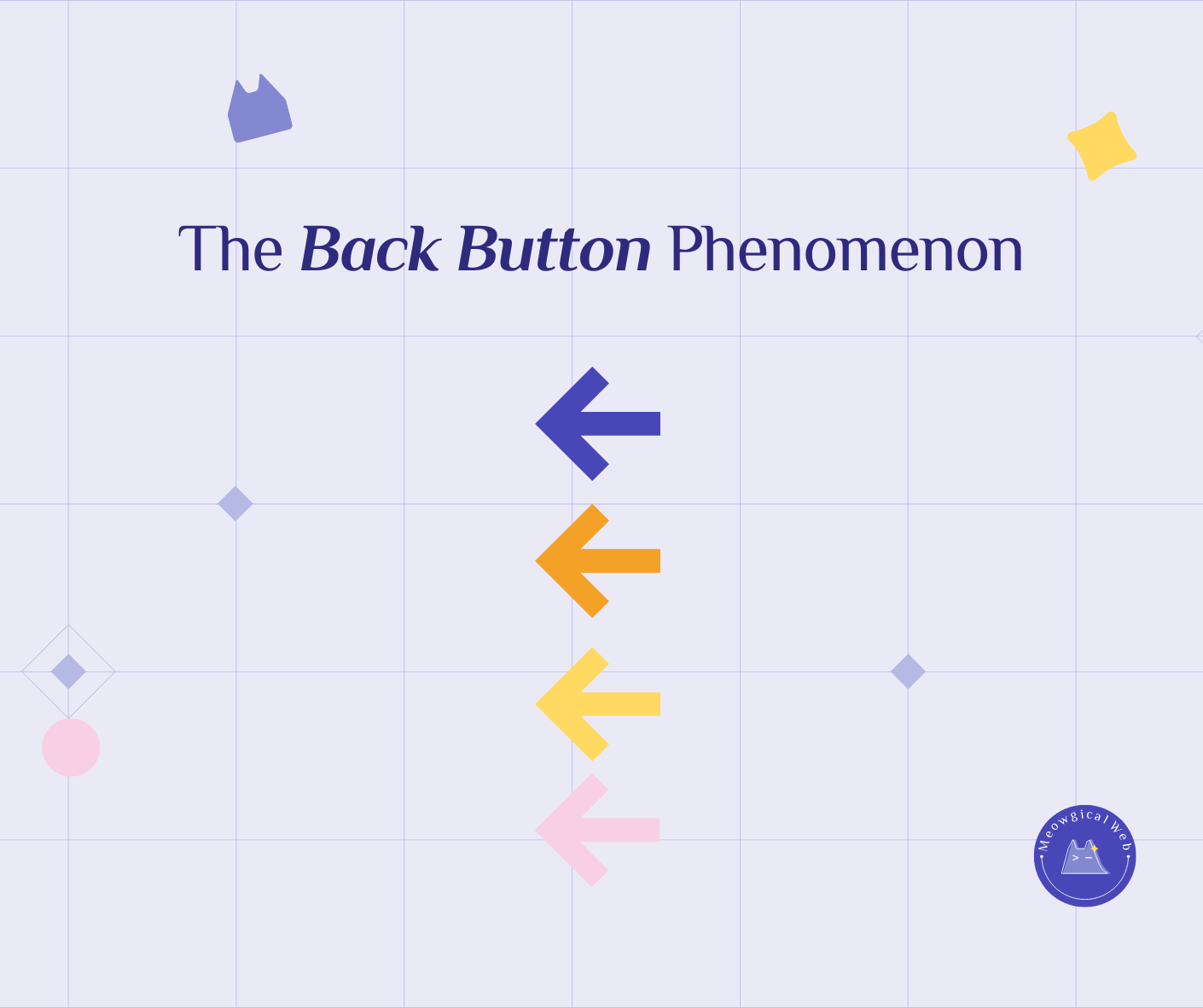
Pet website visitors decide to stay or leave within 10 seconds based on whether they can immediately find phone numbers, service descriptions, pricing information, and service area details. Consequently, the back button gets hit when essential information requires searching or clicking through multiple pages instead of appearing prominently on the homepage. Effective pet business websites answer three critical questions in the first 10 seconds: what specific services you offer, where you’re located, and how to contact you immediately. Therefore, homepages that prioritize clarity over creative design keep visitors engaged long enough to convert into bookings, while confusing layouts lose potential clients before they even understand what you do.
The Veterinary Website Mystery
A veterinary clinic had beautiful website traffic. Hundreds of visitors weekly. However, their phone barely rang. Walk-ins were rare. Therefore, they couldn’t understand why.
Someone finally watched actual users navigate the site. What they discovered was painful. The homepage featured a stunning photo of a golden retriever. Inspirational quote about pet love. Additionally, a “Learn More” button that went… somewhere vague.
No phone number visible. No address. Furthermore, services mentioned generically as “comprehensive veterinary care.” Moreover, nothing indicated they handled cats. Or exotics. Or emergencies.
Users opened the site. Looked around for a few seconds. Additionally, hit back. Every single one. Consequently, the clinic was invisible despite decent traffic.
The clinic added three things to their homepage. Big phone number at top. “Emergency Care Available” in clear text. Additionally, “Dogs, Cats, Small Pets” with icons. As a result, their phone started ringing the same day.
According to Nielsen Norman Group’s research on user behavior, users often leave web pages within 10-20 seconds. Moreover, making a good first impression requires showing value immediately. Therefore, pet parents need specific information fast, not creative exploration.
Similar to how confusing navigation loses visitors, hiding essential information triggers immediate bounces. Furthermore, recovering from bad first impressions is nearly impossible.
What the 10-Second Test Reveals
Open your website. Count to ten. What do you see? Additionally, can someone find your phone number? Your location? What you actually do?
A boarding facility owner tried this exercise. She counted slowly. However, at ten seconds, she realized you couldn’t see their phone number without scrolling. Additionally, nothing on the visible homepage said “boarding.” Instead, it said “pet care facility.” Vague.
She moved the phone number to the header. Added “Dog & Cat Boarding” in huge text. Additionally, put “Located in [City]” right on the homepage. As a result, her booking inquiries doubled within two weeks.
The Four Things People Cannot Find
Phone numbers hiding in footers kill conversions. Someone ready to call immediately can’t find your number. Additionally, they’re not scrolling. Instead, they’re bouncing. Therefore, make your number big, visible, and clickable.
A groomer had their number in tiny text at the page bottom. Gray on white. Additionally, people on phones couldn’t even see it without scrolling and zooming. Consequently, moving it to the header in large, clickable format increased calls by 60%.
Unclear services leave people guessing. “Full-service pet care” tells nobody anything. Additionally, someone with a cat doesn’t know if you handle cats. Furthermore, someone needing training doesn’t know if you offer it.
A multi-service facility changed “Complete Pet Solutions” to specific services: “Grooming, Boarding, Training, Daycare.” Additionally, each service got an icon and one-line description. As a result, their service-specific inquiries increased dramatically.
Missing location information makes people bounce. “Serving the [State]” is too vague. Additionally, someone searching “dog grooming near me” needs to know immediately if you’re actually near them. Otherwise, they leave.
A mobile groomer served a 30-mile radius. Their site said “Mobile Grooming Services.” Additionally, nothing indicated where. Consequently, people in their service area assumed they were elsewhere and left. However, adding “Serving [City], [City], and [City]” with a service area map converted browsers into bookers.
Invisible pricing creates distrust. Nobody expects exact prices for everything. However, completely hiding pricing signals “too expensive to show” or “we’ll price based on what we think you’ll pay.” Therefore, neither inspires confidence.
The Homepage That Worked Too Well
A cat boarding facility rebuilt their homepage with brutal clarity. Top of page: “Cat-Only Boarding in [City]. Call: [Large Clickable Number].”
Below that: Three photos. Individual suites. Play rooms. Grooming area. Additionally, each photo had a three-word caption. “Private Quiet Suites.” “Supervised Play Time.” “Gentle Grooming Available.”
Bottom section: “Starting at $45/night. Book online or call.” Additionally, a big orange “Book Now” button.
That’s it. Simple. Clear. Additionally, their bounce rate dropped from 68% to 32% overnight. As a result, their bookings increased so much they had to hire another staff member.
Someone said it looked “too simple” compared to competitors. However, the owner smiled. “Competitors have pretty websites and empty kennels. Additionally, we have full bookings.”
When Creativity Hurts More Than Helps
Creative homepages with video backgrounds and animated elements look impressive. However, they often hide the most important information behind “experience.” Consequently, visitors leave frustrated.
A high-end pet spa had a gorgeous homepage. Autoplay video of spa treatments. Elegant animations. Moreover, their phone number was nowhere visible. Furthermore, services required clicking through an abstract menu. Their location? Buried in a footer.
Their traffic was excellent. However, bookings were terrible. Additionally, people left because they couldn’t quickly determine if this spa handled their specific need.
They created a “clarity version” as a test. Simple homepage. Big text: “Luxury Pet Spa in [Neighborhood].” Services listed plainly. Additionally, phone number and booking button prominent. As a result, the clarity version converted 3x better than the creative one.
The Mobile Back Button Is Faster
On phones, people are even less patient. Additionally, finding information on small screens is harder. Furthermore, the back button is right there. Easy to tap.
A trainer’s website worked fine on desktop. However, on mobile? Disaster. The phone number required scrolling. Additionally, services were in a hamburger menu people didn’t notice. Furthermore, location information was in tiny footer text.
Mobile users bounced at 78%. Desktop users bounced at 45%. Consequently, optimizing for mobile meant putting critical info in the first screen view. No scrolling required.
What Actually Matters in Those 10 Seconds
Someone visiting your site has a question. “Can you help me?” Additionally, they need the answer immediately. Yes or no.
“Can you groom my nervous rescue dog?” Your homepage should answer this. “Gentle grooming for anxious pets” tells them yes immediately. However, “Professional grooming services” tells them nothing.
“Are you near me?” Your location should be obvious. “Serving Downtown [City]” or “[Neighborhood] Pet Care” answers immediately. Additionally, vague location information wastes those critical seconds.
“How do I contact you?” Your phone number should be unmissable. Big. Clickable. Additionally, in the first view. Not hiding anywhere.
Testing With Real People
Ask someone unfamiliar with your business to visit your site. Set a timer for 10 seconds. Additionally, ask them what they learned.
If they can’t tell you what you do, where you are, and how to contact you, your homepage needs work. Moreover, this simple test reveals exactly what needs fixing.
A doggy daycare tried this. Their friend looked at the site for 10 seconds. They asked “So what did you learn?” Additionally, the friend said “Um… there are dogs? I don’t really know what you do.”
Heartbreaking. But fixable. They added clear text: “Dog Daycare & Boarding in [City]. Drop-off 7am-6pm daily.” As a result, their bounce rate improved immediately.
Making the Changes That Matter
Put your phone number in the header. Large. Clickable. Additionally, make it visible on every page without scrolling.
State your location clearly on the homepage. City. Neighborhood. Additionally, service area if you’re mobile. No hiding.
List your actual services prominently. Specific services. Not vague categories. Additionally, use words people actually search for.
Show pricing information or ranges. “Grooming from $50” gives useful information. However, “Contact for pricing” with no context creates distrust.
Test the 10-second rule yourself. Regularly. Additionally, ask friends, family, or customers to try it. Furthermore, watch what they struggle to find.
The Real Cost of Confusion
Every person who hits back is a potential client who left. Additionally, they’re now booking with your competitor. Moreover, they won’t return to give you a second chance.
That woman whose dog needed grooming? She found a groomer whose number was right on the homepage. Additionally, she’s been a regular client for two years now. However, you never even knew she considered you.
The rescue dog needing training? They called the trainer whose homepage said “Specializing in Rescue Dogs and Reactive Behavior.” However, your site said “Professional Training Services.” Same expertise. Different clarity. Consequently, they never called you.
Clarity isn’t about dumbing things down. Instead, it’s about respecting that people are busy, stressed, and need answers fast. Additionally, the businesses that win are the ones that answer questions before people even finish asking them.
What do you see in the first 10 seconds of your site right now? Open it. Count to ten. Additionally, be honest about whether a stressed pet parent could find what they desperately need.
Those 10 seconds decide everything. Make them count.