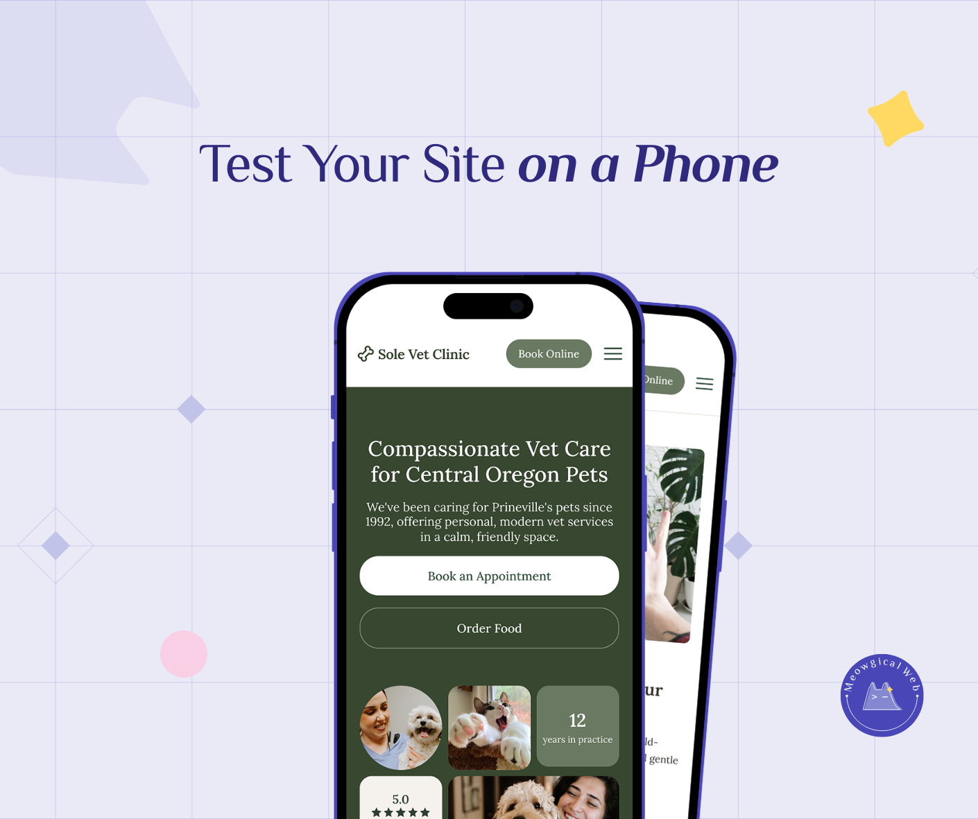
Mobile devices account for approximately 78% of pet service bookings, making mobile-optimized websites absolutely essential rather than optional nice-to-have features for pet businesses. Websites appearing beautiful on desktop computers but breaking on mobile phones lose bookings daily through common problems: unreadable text requiring constant zooming, hidden phone numbers buried in menus, mistaken button taps from inadequate tap targets, and complicated booking processes requiring over two minutes to complete.
Unfortunately, many pet business owners only view their websites on desktop computers and remain completely unaware their mobile experience drives potential clients away. Therefore, mobile-first design prioritizes phone experience from initial planning rather than treating mobile optimization as an afterthought correction. Ultimately, simple testing like handing phones to friends and observing their booking attempts reveals real usability problems before they cost actual business.
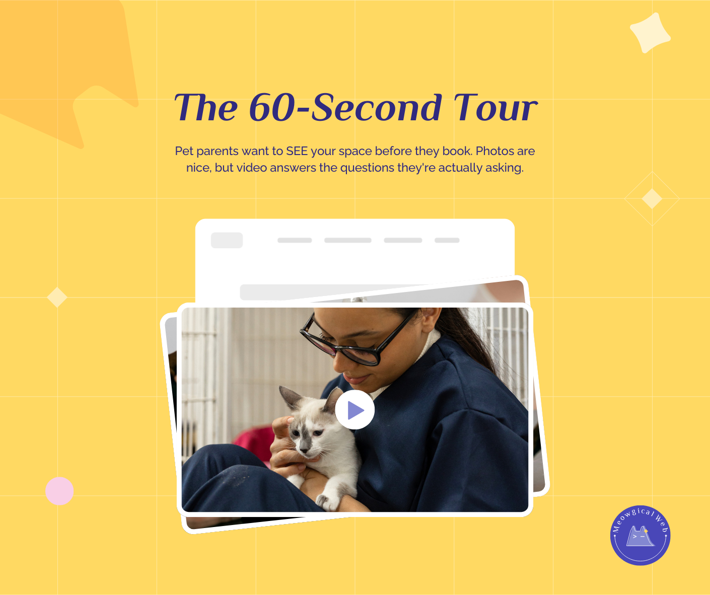
A woman’s dog needs grooming urgently. She’s at work, browsing on her phone during lunch. She finds a grooming salon’s website. It looks promising.
She tries to find their phone number to call. Unfortunately, it’s buried in a menu she doesn’t notice. She scrolls, squints, taps around. After 90 seconds of frustration, she gives up and calls a different groomer whose number was right on their homepage.
The first grooming salon had a beautiful website. On desktop. However, on mobile, it was nearly impossible to use. Meanwhile, they wonder why their phone doesn’t ring as often as expected.
The Mobile Reality
Pull up your website on your phone right now. Seriously, do it before reading further.
Can you easily find your phone number? Is it visible without scrolling or hunting through menus?
Can you read the text without zooming in? Does it feel natural to scan information?
Can you tap buttons without accidentally hitting the wrong thing? Are they big enough for thumbs?
Could you book an appointment in under two minutes? Without getting frustrated or confused?
If you answered “no” to any of these questions, your mobile experience needs work. In fact, that’s costing you bookings every single day.
According to Statista’s mobile web traffic data, over 60% of all web traffic now comes from mobile devices. Notably, for local service businesses like pet care, that percentage is even higher—closer to 70-80%.
Similar to how broken links damage trust silently, poor mobile experience loses clients without you ever knowing they were there.
When Desktop Design Fails Mobile
Many websites are designed on desktop computers. Designers work on large monitors, carefully arranging elements. Everything looks perfect on a 24-inch screen.
Then someone opens that same site on a phone. Suddenly, text is microscopic. Buttons overlap. Images don’t fit. The navigation is confusing. Meanwhile, the beautiful desktop design becomes a frustrating mobile nightmare.
For instance, a boarding facility had gorgeous full-screen hero images on their homepage. On desktop, these created dramatic impact. However, on mobile, each image took up entire phone screens, forcing people to scroll through five images before seeing any actual information. Consequently, most visitors left before reaching the content.
Similarly, a vet clinic designed an elegant three-column layout for their services. On desktop, this looked professional and organized. Yet on mobile, the columns stacked awkwardly, creating endless scrolling with confusing organization.
The Phone Number Problem
Pet parents researching services want to call. They’re on their phones. After all, making a call is natural and immediate.
If your phone number isn’t immediately visible and clickable on mobile, you’re losing calls constantly.
A grooming salon put their phone number in tiny text at the bottom of every page. On desktop, this seemed fine—people could see it. However, on mobile, nobody scrolled down far enough to find it. As a result, potential clients gave up and called competitors instead.
Conversely, a training facility put a large, clickable phone button right at the top of every mobile page. One tap dials immediately. Remarkably, their phone inquiries doubled after this simple change.
Mobile phone numbers should be prominent, large enough to tap easily, and actually clickable to dial. Not just text—an actual link that opens the phone dialer with one tap.
The Text Size Issue
Text that looks readable on desktop often becomes unreadable on phones. Clearly, people shouldn’t need to pinch-zoom to read your content.
For example, a pet sitting service used 14px body text. On desktop, this looked fine. In contrast, on mobile, it was so small people had to zoom every paragraph. Reading their services felt like hard work. Meanwhile, competitors with larger text converted those frustrated visitors.
Minimum 16px text works on mobile. Better yet, 18px makes reading effortless. Remember, people are often browsing in bright sunlight, in moving vehicles, while distracted. Make it easy.
Similarly, contrast matters even more on mobile. Light gray text on white backgrounds is hard to read on desktop. On phones in sunlight? Completely invisible.
The Tap Target Challenge
Fingers are bigger than mouse cursors. Therefore, buttons that seem fine on desktop become impossible to tap accurately on mobile.
A vet clinic had a navigation menu with links spaced tightly together. On desktop with a precise mouse, clicking the right link was easy. However, on mobile, people constantly tapped the wrong link by accident, getting frustrated with the experience.
Apple’s interface guidelines recommend minimum 44×44 pixel tap targets. Android suggests 48×48 pixels. Anything smaller creates frustration. Furthermore, buttons too close together cause mis-taps.
For instance, a daycare had “Book Now” and “Learn More” buttons side by side with minimal spacing. On mobile, people trying to book accidentally hit “Learn More” constantly. They fixed this by stacking buttons vertically with generous spacing. Immediately, booking conversions increased.
The Booking Flow Disaster
Complicated booking processes kill mobile conversions. Obviously, people won’t fight through 15 fields on a tiny screen.
A boarding facility required extensive information upfront: owner name, address, phone, email, pet name, breed, age, weight, medical conditions, dietary restrictions, emergency contact, vet name, and preferred dates. All required fields.
On desktop, this felt thorough. In reality, on mobile, it felt overwhelming. Predictably, most people abandoned the form partway through. The facility’s online bookings were terrible despite decent traffic.
They simplified to just name, phone, and preferred dates for initial contact. Everything else could be collected later. Mobile bookings increased 240%.
Similarly, multi-page forms work poorly on mobile. Each page load feels slow. People lose patience. Instead, single-page forms with clear sections work better for phone users.
The Menu Confusion
Hamburger menus (those three-line icons that expand into navigation) hide your menu on mobile. This seems like a clean design choice. However, it often hides critical information people need.
A grooming salon put all their navigation in a hamburger menu. Services, pricing, hours, contact—everything hidden behind that icon. Many mobile visitors never opened it. They assumed the homepage was everything and left disappointed.
Instead, putting the most critical actions prominently visible—like “Book Appointment” and a phone button—works better. Let people access what they need immediately without hunting through hidden menus.
The Image Problems
Large images that look stunning on desktop often break mobile layouts or load incredibly slowly on phone connections.
For example, a pet photography business used full-resolution portfolio images. On desktop with fast wifi, these looked gorgeous. However, on mobile with cellular data, each image took 10-15 seconds to load. Unsurprisingly, visitors left before seeing the beautiful work.
Mobile-optimized images load smaller file sizes on phones. This speeds up the experience dramatically without sacrificing visual appeal.
Similarly, horizontal images often work better than vertical for mobile viewing. Vertical images can dominate phone screens awkwardly, requiring excessive scrolling.
The Friend Test
Here’s the most valuable test you can do. Hand your phone to a friend who’s never seen your website. Give them a simple task: “Book a grooming appointment for next Tuesday.”
Don’t explain anything. Don’t help. Just watch.
Where do they struggle? What confuses them? When do they get frustrated? Importantly, these moments reveal real problems you’ve been blind to through familiarity.
A training facility did this test. They discovered their mobile site had a critical flaw—the “Services” link in the menu didn’t work on phones. They’d never noticed because they always tested on desktop. Meanwhile, mobile visitors couldn’t access service descriptions, reducing bookings significantly.
Similarly, ask your friend to find your phone number and call it. Can they do this in under 10 seconds? If not, your number isn’t prominent enough.
The Analytics Tell
Check your website analytics. What percentage of visitors come from mobile devices? For most pet businesses, it’s 60-80%.
Now check your conversion rates. Do mobile visitors book at similar rates to desktop visitors? If mobile conversions are significantly lower, your mobile experience is the problem.
For instance, a vet clinic saw 75% mobile traffic but only 30% mobile bookings. This massive gap indicated their mobile experience was failing. After mobile optimization, their mobile booking rate jumped to 65%, nearly matching desktop.
Making Mobile Work
Test everything on actual phones. Not desktop browsers resized to phone dimensions—actual physical phones. Additionally, test on both iPhone and Android devices since they handle websites slightly differently.
Check your site at different times and places. In bright sunlight. On slower cellular connections. While distracted. These real-world conditions reveal problems clean office wifi environments hide.
Prioritize mobile-first design. Start by making the mobile experience perfect. Then adapt to desktop rather than the other way around. This ensures your primary audience—mobile users—gets the best experience.
Simplify everything for mobile. Shorter forms. Bigger buttons. Clearer navigation. More white space. Less scrolling required. Indeed, every element should serve the mobile user’s immediate needs.
The Intentional Difference
The fix isn’t technically complicated. Rather, it’s about being intentional. Mobile experience must be a priority from the start, not an afterthought retrofit.
Many websites treat mobile as “let’s make sure it doesn’t completely break on phones.” That’s not enough. Mobile should be “let’s make sure phones get the absolute best experience possible.”
A mobile groomer rebuilt their site with mobile-first thinking. Every decision considered phone users first. The result? Their mobile booking rate went from 15% to 68%. Same services, same pricing—just a mobile experience that actually worked.
Right Now Test
Pull up your website on your phone again. Try to book an appointment as if you were a new client.
Time yourself. How long does it take? Does anything frustrate you? Would you actually complete the booking if you weren’t testing your own site?
Better yet, hand your phone to someone else. Ask them to book. Watch what happens. Their struggle points are your improvement opportunities.
78% of pet parents book services on their phones. If your site works beautifully on desktop but breaks on mobile, you’re losing bookings every single day without even realizing it.
Fix mobile first. Desktop second. Your bookings will thank you.