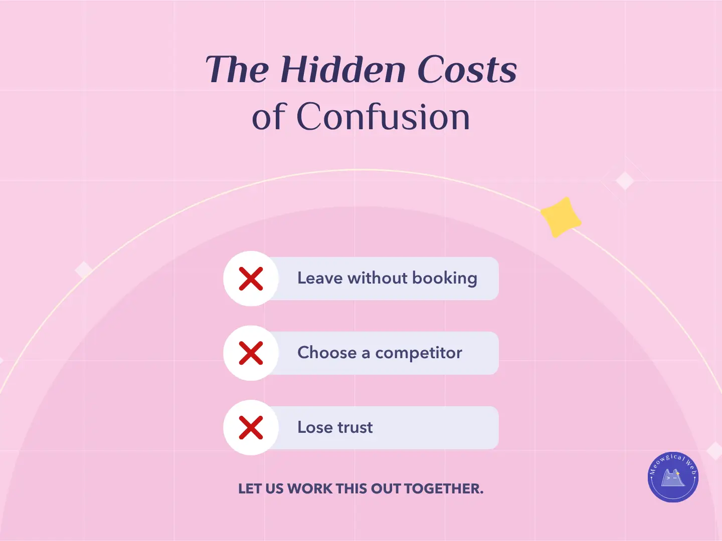
A confusing website does more than frustrate people. It quietly costs your business money. When pet owners cannot find what they need, they feel stressed. As a result, they leave before booking. This is especially true for busy parents who are already juggling time, pets, and decisions.
Because of this, clarity becomes one of the most powerful tools in your design. A clear layout helps people move with ease. A simple menu removes friction. Clear service names reduce mental load. When the experience feels smooth, trust grows naturally.
This applies to all your clients as well. Groomers, pet hospitals, trainers, boarders, and horse farms all benefit from clean navigation and simple next steps. Even relocation services depend on clarity because anxious pet parents need calm guidance.
If you want to explore how emotional clarity builds trust, read our internal guide: How Simple Service Names Build Trust for Pet Businesses
1. Confusion makes people leave fast
Even small moments of uncertainty push visitors away. When a button is unclear or a service name is vague, people pause. That pause creates doubt. Doubt leads to drops in bookings.
For example, if someone cannot find your prices, they assume the process will be stressful. In the same way, if your menu is cluttered, they assume your service experience might be unclear too.
To learn more about how friction affects decisions, here is a helpful outside resource: What’s the cost of bad UX?
2. Confusion sends people to your competitors
Pet owners do not want the “best deal”. Instead, they want the option that feels easy, safe, and reliable. When your website feels confusing, visitors assume another business will be simpler.
Because of this, you lose clients even before they compare prices.
To explore how clarity increases conversions, this external article is useful: Tips for Successful Conversion‑Centered Design
3. Confusion damages trust
Trust forms fast. So does distrust. When a website feels messy, people question the professionalism behind it. They think, “If the website feels unclear, will the service feel unclear too?”
At Meowgical Web, we build pet websites that remove friction everywhere. Buttons stay in familiar places. Menus stay simple. Colors stay calm. As a result, visitors feel safe enough to book.
If you want to fix the emotional side of clarity, here is the internal link again: How Simple Design Creates Stronger Results for Pet Businesses
Final Thought
Confusion is expensive. Clarity is profitable. When visitors understand your services, your process, and your next steps, they stay longer. They explore more. And they book with confidence.
Clean design builds trust. Trust brings bookings.
If you want a website that feels simple, warm, and easy for pet owners, we can help.
Let’s create something Meowgical together.
Book your free consultation →