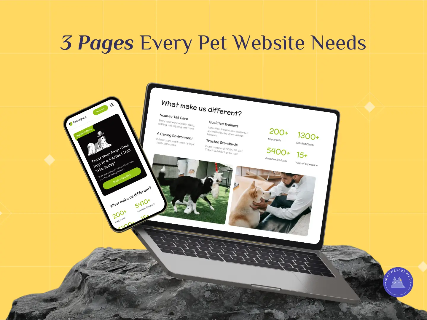
Every pet business needs a website that feels clear, warm, and easy to trust. While fancy features can help, most pet parents still look for three simple things when they land on your site. Because of this, these three pages shape how fast people trust you and how quickly they decide to book. In fact, they guide visitors through your brand in a gentle and natural way.
These pages are not about ticking an SEO box. Instead, they help pet parents feel safe, informed, and ready to take action.
1. About You
Pet parents want to know the human behind the care, so this page matters more than most people expect. They look for warmth, honesty, and a sense of who you are. When your About page explains what you believe in, how you work, and why pets matter to you, people feel connected right away. As a result, trust forms faster because your values feel real.
If you want ideas on how to show your values with clarity, here is a helpful internal resource: The Simple Reason Your “Why” Makes Your Pet Brand Stronger

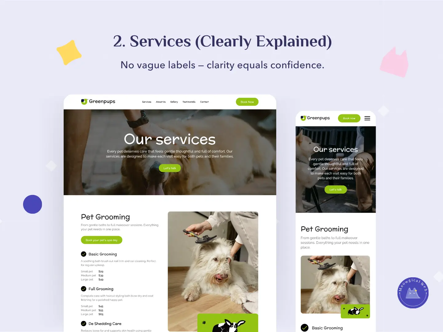
2. Services Page (Clearly Explained)
Vague labels confuse visitors, and confused visitors rarely book. Clear names convert better because they set expectations from the start. When people understand what you offer, they feel more confident moving forward. Additionally, simple descriptions, straightforward pricing, and friendly wording reduce decision fatigue. This leads to smoother decisions and happier clients.
For more insight, you can read this article on why clarity increases conversions: What Is Brand Consistency?
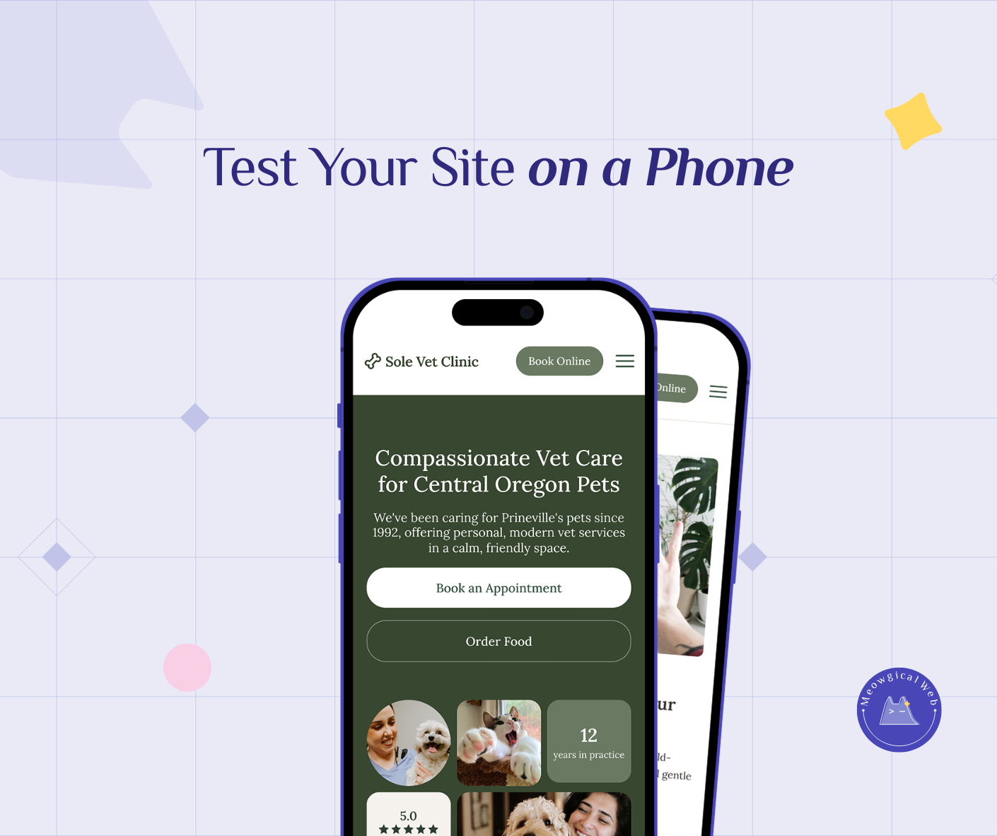
3. Contact or Booking Page
A clear path matters, and this page often determines whether someone reaches out or leaves. A strong website gives people one simple action: book, call, or send a message. When visitors see clean design, helpful details, and easy forms, they take the next step with confidence. Because the process feels simple, they are more likely to follow through.
If you want to explore how small changes improve booking flow, see our internal link: Why Easy Online Booking Helps Pet Owners Choose You Faster

Final Thought
These three pages form the foundation of trust. Together, they help visitors understand who you are, what you offer, and how to reach you. When those pieces stay clear and consistent, your website feels calmer and more reliable. And calm experiences build trust faster than complexity ever could.
If you want your website to feel warm, simple, and easy to book from, we can help you build it.
Let’s create something Meowgical together.
Book your free consultation →