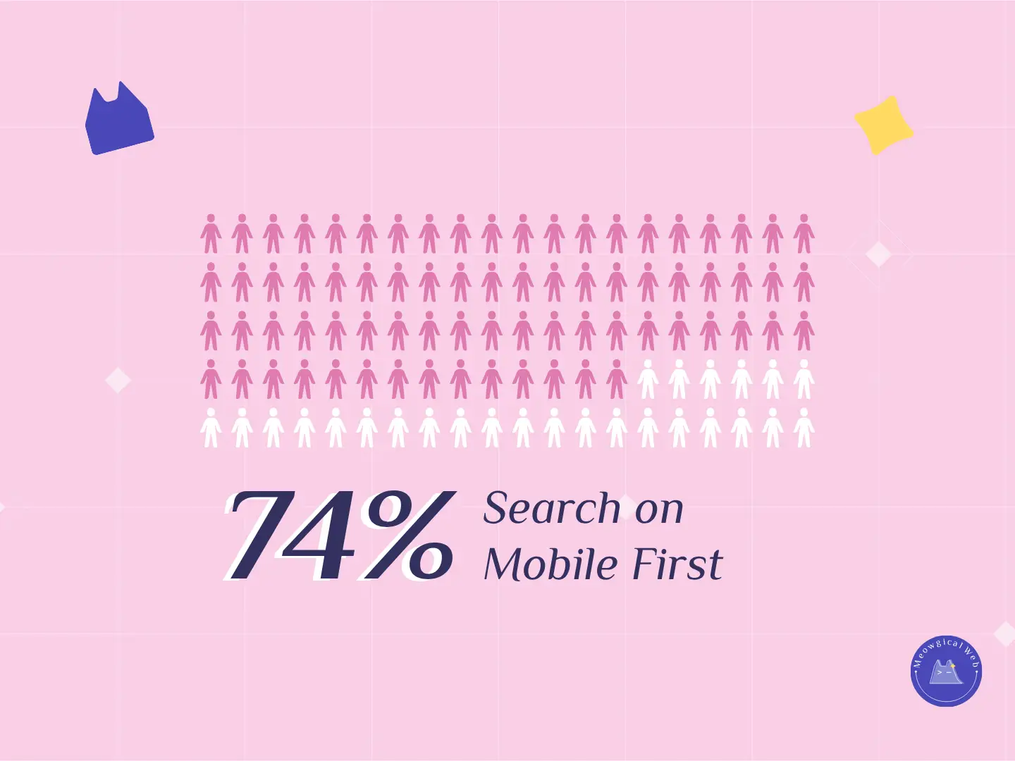
Did you know that 74% of pet owners search for pet services on their phones first?
That means most of your potential customers are already scrolling — not clicking from a computer.
However, many pet businesses still rely on outdated, desktop-only websites.
As a result, they lose valuable bookings and credibility simply because their site isn’t mobile-friendly.
When your site doesn’t fit the screen, loads too slowly, or hides the “Book Now” button, your visitors leave within seconds.
Therefore, a responsive, fast mobile site isn’t just nice to have — it’s essential for building trust and growing your pet brand online.
1. Why Mobile Matters More Than Ever
Pet parents are busy, caring people.
They’re often searching between errands, during commutes, or while cuddling their furry friend on the couch.
As a result, they expect a website that’s quick, easy, and friendly — just like your service.
If your site takes more than 3 seconds to load, 53% of users will leave (Google Research, 2024).
In short: if your site isn’t mobile-ready, you’re invisible to most of your audience.
Related: 3 Website Mistakes That Make Pet Businesses Lose Clients
2. What a Mobile-Friendly Site Looks Like
A good mobile website doesn’t just “shrink” your desktop version.
It adapts to small screens while keeping the experience clear, intuitive, and emotionally consistent.
Here’s what that means for pet businesses:
- Fast loading speed — because every second counts.
- Tap-friendly buttons — no one likes pinching and zooming to book a nail trim.
- Readable text sizes — fonts that feel comfortable and calm.
- Optimized images — crisp visuals that load fast without breaking the layout.
- Clear calls-to-action (CTAs) — visible “Book Now” or “Call Us” buttons that stand out instantly.
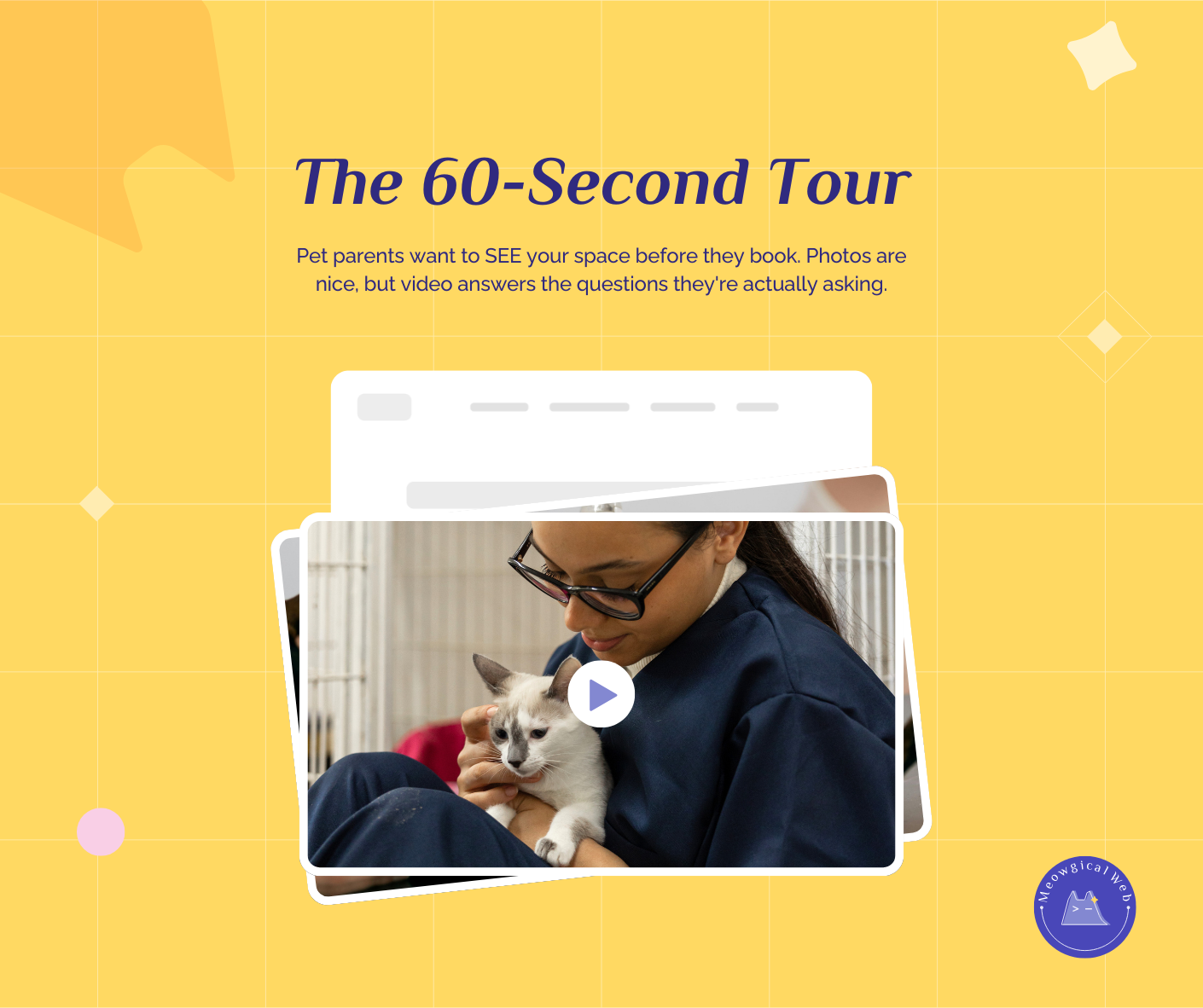
For example, if you’re a pet groomer, your booking form should appear clearly within the first scroll on mobile — not buried under heavy images or long intros.
Read more: Keep It Simple: Pet Website Design That Builds Trust Fast
3. How Mobile Design Builds Trust and Conversions
A responsive site doesn’t just look good; it feels trustworthy.
When visitors can easily browse, call, or book without confusion, they subconsciously associate your brand with professionalism and care.
Therefore, mobile UX directly affects your conversion rate.
Pet parents who enjoy their first visit on your site are more likely to:
- Call or book immediately
- Leave a positive review
- Share your site with other pet owners
In other words, every smooth mobile interaction turns browsers into believers.
4. Small Changes, Big Impact
Even small improvements can transform your mobile site’s performance:
- Compress large images to load faster (try TinyPNG)
- Test mobile layouts with Google’s Mobile-Friendly Test
- Simplify your homepage by focusing on your top services and emotional messaging
Because when your site runs smoothly, it feels like care — and care is the heart of every pet business.
Final Thought
A mobile-first design isn’t just about screens and sizes.
It’s about empathy — meeting pet parents where they are, with simplicity and warmth.
So, next time you think about redesigning your website, start small, literally.
Design for the phone first, and you’ll win hearts faster than any flashy desktop banner could.
Let’s make your pet business mobile-ready →