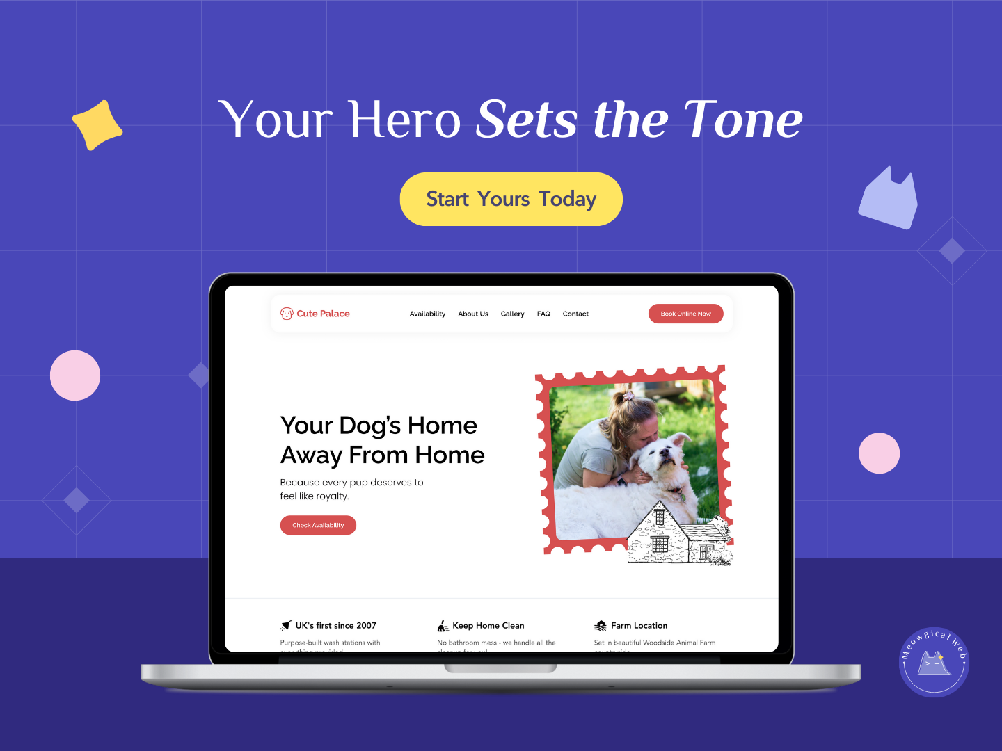
Your homepage hero is more than a pretty banner. Because it appears first, it becomes the moment visitors start forming their very first impression of your brand. In only a second or two, people sense the tone of your business. They pick up on your energy, your warmth, and your level of care. As a result, this small section plays a huge role in trust and comfort.
That is why thoughtful pet brands treat the hero section as a space to guide, calm, and reassure. When the message is clear and the visual mood feels right, visitors relax. And once they relax, they are far more likely to stay, read, and eventually book.
1. Set a clear mood
Your hero should express how you want clients to feel. Calm colors create comfort. Warm photos build emotional connection. Friendly words show care. When these details blend together, your brand feels intentional. Because mood shapes emotion, this choice matters more than most people expect.
If you want more guidance on shaping brand mood, you can explore this internal guide: Voice is the new logo: Why your brand’s tone matters more than ever
2. Speak with a confident voice
Visitors look for signals of trust. A clear headline and a simple sentence create confidence. Pet parents want to understand what you offer right away. Because clarity lowers anxiety, a straightforward message always outperforms a clever one.
For related topic, this resource explains how clarity increases conversions: How a Strong Above the Fold Builds Instant Trust
3. Give one simple next step
Confusing or crowded actions make visitors hesitate. And hesitation slows bookings. Instead, one straightforward button helps visitors feel supported. Whether you say “Book now,” “Check availability,” or “See services,” the path becomes easier to follow.
If you want to explore how small layout shifts improve action flow, here is another internal resource: Why a Comfortable Website Wins More Loyal Pet Parents Quickly
Final Thought
Your hero isn’t the beginning of your website. It is the beginning of your visitor’s experience with you. When it feels calm, clear, and warm, people stay longer. They read more. And they trust you enough to take the next step.
If you want your hero section to feel soft, confident, and easy to understand, we can help you shape it.
Let’s create something Meowgical together.
Book your free consultation →