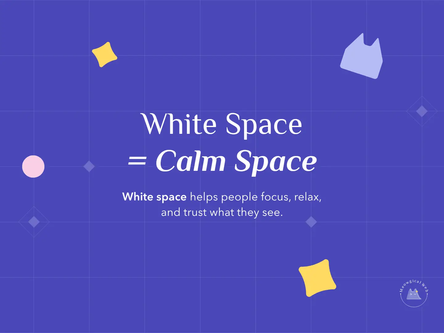
White space might look simple, yet it changes how people feel the moment they land on your website. When your layout has room to breathe, visitors stay longer because their eyes can relax. As a result, they notice your message faster and trust it more.
This small design choice matters even more in the pet world. Pet parents usually arrive on your site already feeling emotional or rushed. When they see a clean and calm space, they feel safe, supported, and understood.
At Meowgical Web, we use white space to guide attention, reduce noise, and build comfort. Because of this, your brand feels warmer and more premium without adding anything complicated.
If you want to learn how calm design supports trust, here is our internal guide: The Powerful Way Calm Design Builds Pet Loyalty
1. White space builds trust faster
When your site gives people room to breathe, they process information more easily. They do not need to fight for focus. Instead, they move through your content with steady confidence.
This sense of calm reduces stress, which is especially helpful for grooming studios, vet clinics, trainers, and even pet sitters. Every space you leave open acts like a quiet pause that helps visitors stay grounded.
To see why simplicity supports trust, here is an external resource on visual hierarchy: Visual Hierarchy in UX
2. White space highlights what matters
When you remove clutter, your message becomes stronger. Photos look warmer. Text feels clearer. Buttons stand out without shouting.
Because of this, white space works better than bright labels or heavy graphics. It naturally brings attention to your care, your services, and your values.
If you want to make your layout even simpler, this internal link gives clear steps:
Internal link: How Simple Design Creates Stronger Results for Pet Businesses
3. White space makes your brand feel premium
Luxury brands use white space because it signals quality. Pet brands can do the same. With calm spacing, your website looks professional without trying too hard. It also creates a familiar sense of trust that helps people book faster.
This works well for grooming salons, trainers, boarding facilities, rescues, vets, and even handmade pet shops. A calm layout says you care about both detail and experience.
For more insight on why minimal design works, this external article is helpful:
External link: Minimal UI Design
Final Thought
White space is not empty. It is intentional. It gives your message room to shine and your visitors space to feel calm. When your website feels clear and peaceful, people trust you more, stay longer, and book with confidence.
If you want a pet website that feels warm, simple, and premium, we can build it for you.
Let’s create something Meowgical together.
Book your free consultation →