Pet business websites with text smaller than 16px, decorative script fonts, and low-contrast color schemes like light gray on white look elegant in design mockups but lose bookings from older pet parents who can’t read the content. Website readability directly impacts conversion rates because most pet owners are over 40 and browse on mobile devices where tiny text becomes illegible. Readable websites combine beauty with function using minimum 16px body text, high-contrast dark text on light backgrounds, simple sans-serif fonts for body content, and generous line spacing that accommodates aging eyes without sacrificing visual appeal.
Picture this. A 62-year-old woman just adopted a senior cat. Her friend recommended a vet clinic with a gorgeous website. Soft pink backgrounds. Elegant script font. Everything looks refined.
She pulls up the site on her phone. Squints at the tiny text. Additionally, she can’t find the phone number. The hours are somewhere but the gray text blends into the background.
She gives up. Calls a different vet. Additionally, their website had big text and clear contact info. Not as pretty. But she could actually read it.
The first clinic lost a potential lifetime client. Moreover, they’ll never know why. Their analytics just show “visitor bounced after 18 seconds.”
The Design That Won Awards But Lost Clients
A luxury pet spa launched last year. Their website won a local design award. Stunning photography. Minimalist aesthetic. Additionally, everything felt high-end and exclusive.
Their booking rate was terrible. Beautiful traffic. Low conversions. Moreover, they couldn’t figure out why people visited but never booked.
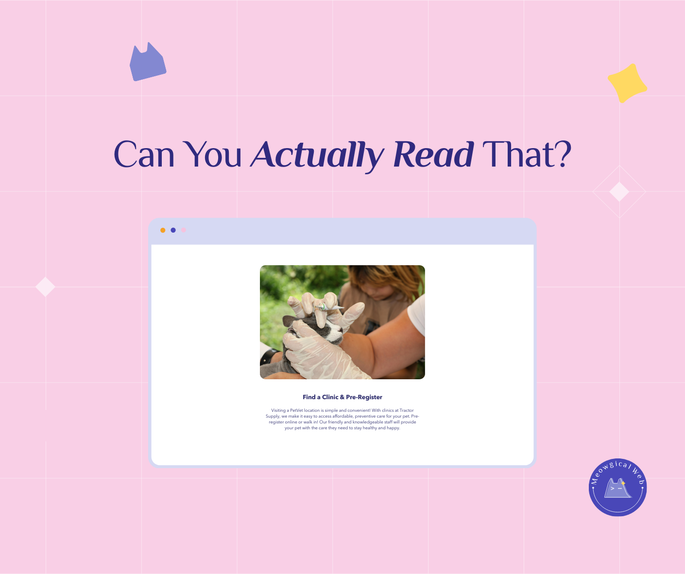
Someone finally tested the site with actual pet owners. The body text was 13px. Additionally, the font was a thin, elegant typeface that looked amazing in the design file. On phones? Nearly invisible.
The contact information lived in 11px light gray text at the bottom. Moreover, their prices were in a decorative script font that looked fancy but required zooming to decipher.
They redesigned with readability first. Bigger text. Higher contrast. Additionally, clear fonts. Their booking rate doubled in six weeks. Same services. Same prices. Just readable.
According to WebAIM’s accessibility guidelines, text should have a contrast ratio of at least 4.5:1 for normal text and 3:1 for large text. Most “elegant” light gray designs fail this dramatically. Moreover, the average pet owner is over 40 with declining near vision.
Similar to how website speed affects bookings, readability directly impacts whether visitors can actually use your site.
What Happens on Actual Phones
Design mockups look perfect on 27-inch monitors. Everything’s crisp and clear. Additionally, designers zoom in and out constantly while building. They never experience the site like real users do.
Real users open your site on a phone while their dog pulls the leash. Sunlight glares on the screen. Additionally, they’re stressed because they need a groomer TODAY.
That beautiful 12px font? Impossible to read. The fancy script in your headlines? Their eyes can’t even focus on it. Moreover, the light gray text on white background completely disappears in sunlight.
A mobile groomer learned this the hard way. Her website looked incredible. Additionally, her target market was busy professionals who’d love mobile grooming convenience.
Those professionals were booking competitors. She finally asked why. “I couldn’t read your site on my phone. Additionally, I gave up trying to find your prices.”
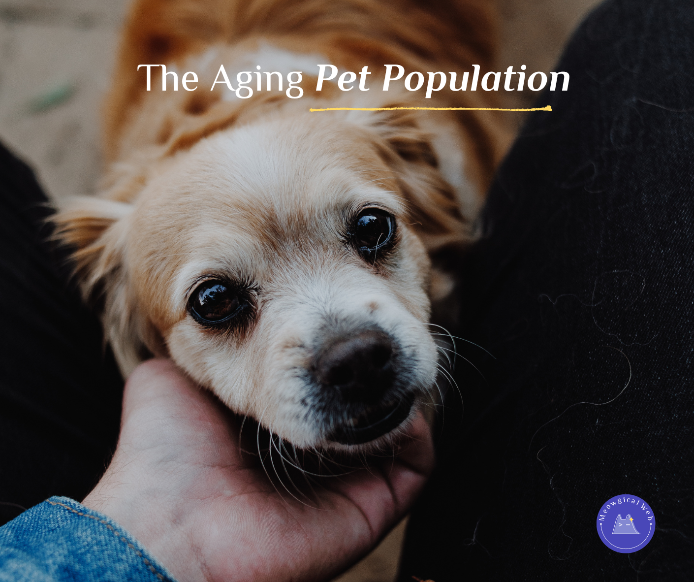
The Over-50 Reality Nobody Mentions
Here’s an uncomfortable truth. Most pet owners are over 40. Additionally, many are over 60. These people have money. They book premium services. Moreover, they can’t read tiny text.
Presbyopia starts around age 40. Everyone’s near vision declines. Additionally, it’s not about needing glasses. Even with glasses, tiny text on small screens is exhausting.
A boarding facility owner is 58. She books vacation herself constantly. Additionally, she experiences firsthand how frustrating tiny text feels. Yet her own website had 13px body text.
Someone pointed this out. She was shocked. “I thought that was normal!” Moreover, she’d never actually tried to read her own site on her phone in bright daylight.
She increased everything to 18px. Added more contrast. Additionally, her inquiry calls increased 30% that month. People could finally find her phone number and hours without zooming.
The Script Font Problem
Script fonts look elegant. Romantic. High-end. Additionally, they’re absolutely terrible for body text. Even at decent sizes, they’re hard to read.
Headlines? Sure. Logos? Perfect. Moreover, use them for accents. But never for paragraphs of text. Your eyes can’t scan script fonts quickly.
A cat boarding facility used script font for everything. Their tagline. Their service descriptions. Additionally, even their pricing. It looked cohesive and fancy.
Nobody could read it. Pet parents gave up trying. Moreover, they assumed if the website was this hard to use, the actual facility probably had issues too.
Switching to a simple sans-serif font felt boring at first. “It doesn’t look special anymore,” the owner worried. Additionally, bookings immediately improved. Special doesn’t matter if people can’t read it.
Contrast Makes or Breaks Everything
Light gray text on white backgrounds looks sophisticated. Minimalist. Additionally, completely unreadable for millions of people.
Black text on white background seems harsh to designers. Too stark. Moreover, it’s actually what human eyes read most easily. That harsh contrast is accessibility.
Medium gray on light gray? Forget it. A veterinary website used this everywhere. Additionally, they wondered why phone calls asked the same questions their website supposedly answered.
People weren’t reading the site. They couldn’t. Moreover, rather than struggle, they just called to ask basic questions listed on unreadable pages.
The Spacing Nobody Thinks About
Line spacing matters enormously. Cramped text creates visual density that overwhelms eyes. Additionally, generous spacing makes reading effortless.
Most websites use default line spacing. It’s too tight. Moreover, increasing line height to 1.6 or 1.8 makes massive readability differences.
A grooming salon increased their line spacing. Changed nothing else. Additionally, their average time on site increased by 40 seconds. People were actually reading instead of bouncing.
Testing With Real People
Hand your phone to someone over 50. Can they read your site easily? Additionally, watch where they struggle. That’s where you need fixes.
Don’t just ask “can you read this?” Actually watch them try to find information. Your hours. Your prices. Additionally, your phone number. Notice when they zoom in. That’s a readability failure.
One pet supply store did this exercise. The owner’s mother couldn’t find the address. Additionally, she couldn’t read the store hours. Both were on the site in 11px gray text.
That weekend, the owner fixed everything. Bigger text. Better contrast. Moreover, their in-store traffic increased noticeably the next week.
Beautiful AND Readable Isn’t a Tradeoff
People think readable means ugly. Corporate. Additionally, boring. That’s absolutely wrong. You can have gorgeous designs that are also readable.
Use your fancy fonts in headlines at large sizes. Pick elegant colors that still have strong contrast. Additionally, create visual interest through layout and photography instead of relying on tiny decorative text.
A pet photographer’s website proves this perfectly. Stunning visuals. Beautiful typography. Moreover, everything’s completely readable on phones. Body text at 18px. High contrast. Simple fonts.
It’s elegant AND functional. Additionally, her booking rate is triple the industry average.
Making the Changes Today
Check your body text size right now. If it’s under 16px, increase it. Additionally, 18px is even better for pet businesses where older clients dominate.
Test your contrast using free tools like WebAIM’s contrast checker. Aim for at least 4.5:1 ratio. Moreover, higher is better.
Switch body text to simple sans-serif fonts. Save decorative fonts for headers and accents. Additionally, increase line spacing to 1.6 or more.
Test everything on your phone. In bright sunlight if possible. Additionally, ask someone over 50 to try booking with you while you watch.
The Real Cost of Pretty
That gorgeous website that won design awards? It might be costing you thousands in lost bookings. Moreover, you’ll never know because people just leave silently.
They don’t email saying “your text was too small.” They just book with someone whose site they could actually read. Additionally, they tell their friends “I found this great groomer” without mentioning they tried you first.
Readability isn’t about dumbing down design. It’s about respecting that your website exists to help people book services. Moreover, beautiful communication requires being readable.
Can you read your own website easily on your phone right now? Can your parents? Additionally, if you’re squinting or zooming, your clients are too. Most of them just leave instead.
Make it bigger. Make it clearer. Moreover, watch your bookings improve when people can actually read what you offer.