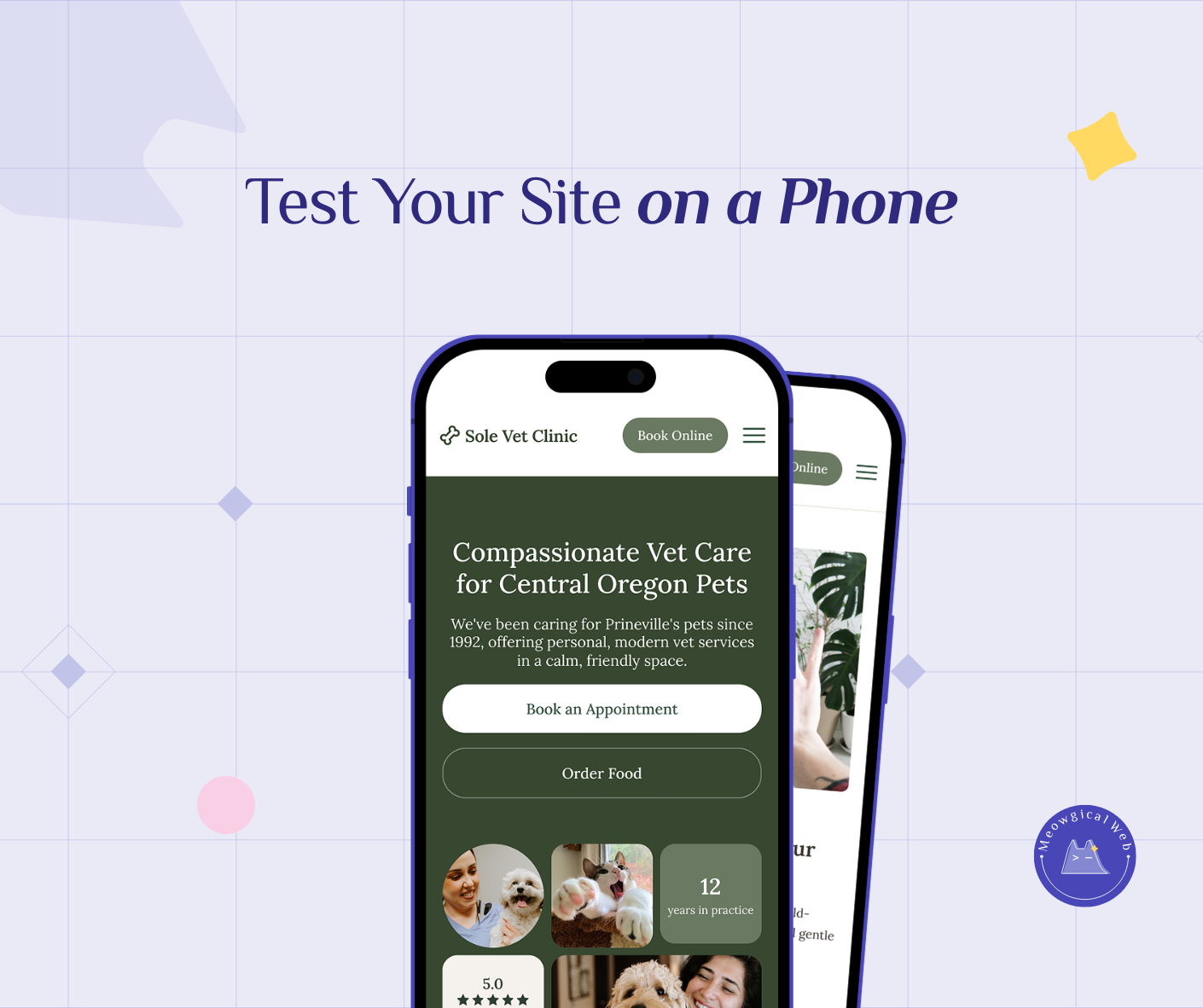
Pull out your phone right now. Open your pet business website. Then try tapping your “Book Now” button using only your thumb.
Can you reach it comfortably? Or do you need to shift your grip, use two hands, or stretch uncomfortably?
If it’s awkward, you’re losing bookings every single day.
The One-Handed Reality
Here’s what’s actually happening when someone tries to book your pet services. They’re standing in line at the coffee shop. Holding their dog’s leash. Carrying grocery bags. Additionally, managing a toddler. Living real life.
In fact, rarely anybody sits at a desk with both hands free to carefully navigate your website. Instead, they’re using their phone with one hand while juggling everything else.
Therefore, your booking button needs to work for that reality. Not for the perfect conditions that never exist.
Where Thumbs Actually Reach
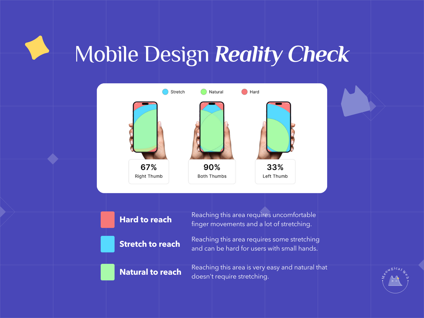
Research on mobile phone usage reveals something crucial. Most people can only reach about 67% of their screen comfortably with their thumb. The bottom third? Easy. The middle? Doable. However, the top corners? Nearly impossible without adjusting their grip.
Yet so many pet business websites put the booking button exactly where thumbs can’t reach. Top right corner. Header navigation. Anywhere except where it’s actually accessible.
This isn’t just inconvenient. In fact, it directly costs you money. Pet parents who can’t easily tap your booking button will close the tab. Then try another business instead.
The Common Mobile Design Mistakes
Top corner buttons. The classic mistake. Your booking button sits in the top right corner because that’s where desktop website conventions suggest it should go. However, on mobile, that’s the hardest spot to reach.
Tiny tap targets. Your button looks fine on desktop. On mobile, it’s barely bigger than someone’s fingertip. Consequently, stressed pet parents tap it three times before hitting it successfully. Then they give up.
Hidden behind menus. Users have to tap a menu icon, scroll through options, find the booking link. Then finally access your scheduler. That’s three extra steps for someone managing a squirming puppy.
No sticky elements. The booking button appears at the top of your homepage. Once someone scrolls down reading about your services, the button disappears. Therefore, they can’t book without scrolling all the way back up.
According to mobile UX research, placing important actions in hard-to-reach zones increases task failure rates. In fact, failure rates increase by up to 50%.
Where Your Booking Button Should Actually Be
The bottom third of the screen is prime real estate. That’s where thumbs naturally rest. Therefore, that’s where your most important button belongs.
Consider adding a sticky booking button that stays visible as users scroll. It doesn’t have to be huge or intrusive. Just consistently accessible. Meanwhile, pet parents can read about your services while always having the option to book right there.
Additionally, make your tap targets bigger on mobile. If your booking button is tiny, increase its size. Stressed people with hurried fingers need forgiving touch targets.
Testing Your Own Site
Here’s a simple test. Hand your phone to someone who’s never seen your website. Then ask them to book an appointment using only their thumb. Don’t give instructions. Instead, just watch what happens.
Do they find the button immediately? Or do they hunt around? Can they tap it easily? Or do they miss and hit something else? Furthermore, can they complete the booking without switching to two hands?
Their struggle is exactly what your potential clients experience. Every. Single. Day.
The Sticky Button Solution
Sticky buttons solve the accessibility problem elegantly. Your main booking button can stay in your header or hero section. However, add a smaller sticky button that appears once someone scrolls past the fold.
This button follows them down the page. Always visible. Always reachable. Most importantly, always one thumb-tap away from booking.
Many website builders include sticky button options. WordPress plugins make this easy. Even simple CSS can create a basic sticky element. The technical implementation is straightforward. Meanwhile, the booking increase is significant.
Mobile-First Design Thinking
Desktop-first design creates mobile problems. You design for large screens and wide layouts. Then you try squeezing everything onto phones. Naturally, important elements end up in awkward places.
Instead, start with mobile. Where would a stressed pet parent’s thumb naturally be? Design your layout around that. Then expand to larger screens. This approach ensures mobile users get the best experience. Not the compromised afterthought.
Pet services particularly need this thinking. Your clients aren’t leisurely browsing from office computers. Rather, they’re checking your site while their dog pulls on the leash. Make their experience as friction-free as possible.
Beyond Just Booking Buttons
The thumb zone principle applies to everything important on your mobile site. Phone numbers. Contact forms. Service selection. Additionally, navigation menus. Anything you want users to tap should be easily reachable.
Review your entire mobile layout. What actions do you want pet parents to take? Are those options accessible with one-handed use? If not, reorganize your layout.
Additionally, consider the flow between actions. Someone might want to check prices, then call you, then book online. Make that journey smooth for one-handed navigation.
The Quick Wins
You don’t need a complete redesign. Instead, start with simple improvements. Move your booking button to the bottom of your mobile screen. Make it sticky so it follows as users scroll. Furthermore, increase its size to be easily tappable.
Test these changes on your own phone. Book a test appointment using only your thumb. If you can do it comfortably, your clients probably can too.
Then ask a friend to try. Watch where they struggle. Finally, fix those friction points. Mobile optimization is about removing obstacles between interest and booking.
Real Impact on Bookings
Pet businesses that optimize for thumb-friendly mobile design see immediate booking increases. Why? Because they removed the most basic barrier. Consequently, people who wanted to book suddenly can book.
One grooming salon moved their booking button from the top corner to a bottom sticky position. As a result, bookings from mobile increased 34% in the first month. Same traffic. Same services. Just easier access to the button that matters.
That’s the power of designing for how people actually use their phones. Not how we wish they would. Instead, how they really do. Related to: The Proven Mobile Upgrade That Makes Pet Sites Feel Better
Start Testing Today
Right now, pull up your website on your phone. Try booking using only your thumb. Notice every awkward reach. Every missed tap. Furthermore, every moment of frustration.
That’s what your potential clients experience. Fix it, and they’ll reward you with bookings.
Mobile optimization isn’t about fancy features. Rather, it’s about removing friction. Making the most important action – booking your services – as easy as humanly possible. Especially for stressed pet parents using phones with one hand.
Put your booking button where thumbs actually are. Then watch your bookings increase.