“Just make it pretty.”
A pet grooming client said this to us last week. We could have nodded, sent a proposal for a design refresh, and collected an easy paycheck. Instead, we asked a different question.
“What’s actually broken?”
The answer surprised them. Their website was getting plenty of traffic. People read their blog posts about grooming tips. The before-and-after photos got tons of engagement. However, hardly anyone was booking appointments.
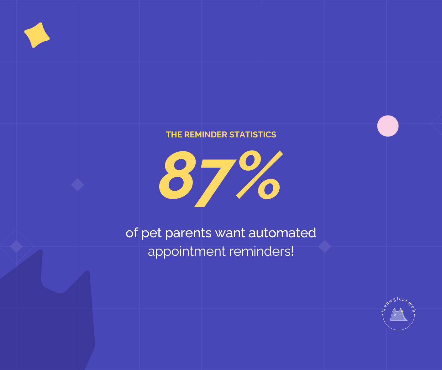
The culprit? Their booking process required calling during business hours, leaving a voicemail, waiting for a callback, and then scheduling. In 2026, most pet parents are researching groomers at 10pm after the kids are asleep. They’re not calling anyone during business hours.
We didn’t redesign a single page. Instead, we added online booking with automated confirmations. Bookings tripled within a month. Related post: Why simple booking flow becomes even more valuable
The Aesthetics Trap
Pet business owners often focus on making their websites look better when the real problem lies elsewhere. This makes sense psychologically. Visual problems are easy to spot. “My website looks outdated” feels like a clear issue to fix.
Meanwhile, conversion problems are invisible. You don’t see the people who tried to book at 11pm and gave up. You don’t know how many potential clients bounced because they couldn’t find your prices. These invisible problems cost far more than ugly design ever could.
Beautiful websites matter for first impressions, absolutely. However, once someone decides they might want your services, functionality determines whether they actually book. A gorgeous website with a terrible booking process loses to an ugly website where booking is effortless.
What Actually Stops People From Booking
Most pet business websites have one of five problems, and none of them are aesthetic.
The biggest issue is booking friction. People want to schedule appointments when it’s convenient for them. If your only option is “call us Tuesday through Friday between 9am and 5pm,” you’re excluding everyone who works normal hours. Additionally, you’re competing against businesses that let people book anytime.
Hidden information creates another barrier. Pet owners want to know your prices before reaching out. They need to understand your location and service area. If finding basic information requires a phone call, many people won’t bother. They’ll simply book with someone more transparent.
Mobile problems kill conversions too. Your website might work perfectly on your desktop computer. Unfortunately, if buttons don’t work on phones or forms require endless zooming and scrolling, you’re losing most visitors. More than 70% of pet service searches happen on mobile devices.
Slow loading times drive people away before they even see your site. A beautiful website that takes eight seconds to load performs worse than a basic website that loads instantly. Furthermore, Google punishes slow sites in search rankings, so you get less traffic too.
Finally, unclear next steps leave people confused. Your site might look amazing, but if visitors can’t figure out how to actually book or contact you, aesthetics become irrelevant.
How We Identify Real Problems
When someone requests a website redesign, we start with questions instead of proposals. How many people visit your site each month? How many of those visitors book appointments? Where do most people leave your site?
These questions reveal the actual issues. One veterinary clinic wanted a complete redesign because their site “looked old-fashioned.” After digging deeper, we discovered their real problem was a new client form that took 15 minutes to complete. Nobody finished it. We simplified the form to three required fields and moved everything else to their first appointment. New client bookings increased 60%.
Another pet boarding facility wanted fancy animations and video backgrounds to match a competitor’s flashy site. Their actual problem was that potential clients couldn’t check availability without calling. We added a simple availability calendar. Bookings jumped 40% without touching any design elements.
A mobile grooming service wanted to copy a competitor’s trendy layout. However, their service area information was buried three pages deep on their site. We moved it to the homepage with a clear coverage map. Service requests doubled immediately.
The Solutions That Drive Results
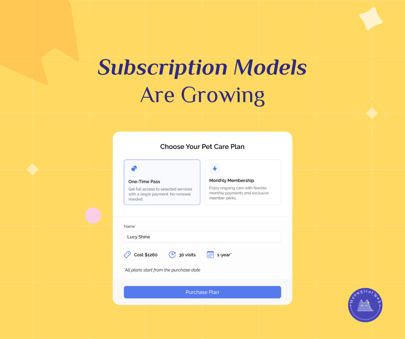
Online booking removes the biggest barrier between interest and revenue. People can schedule appointments at midnight in their pajamas if that’s when they’re thinking about pet care. They get instant confirmation instead of playing phone tag. Moreover, they can see your availability and pick times that work for their schedule.
Clear pricing helps people self-qualify before contacting you. They know whether your services fit their budget. Transparency builds trust while reducing time-wasting inquiries from people who can’t afford your services anyway.
Automated confirmations and reminders create professional impressions while reducing no-shows. Clients receive immediate confirmation emails when they book. They get reminder texts 24 hours before appointments. Your staff doesn’t have to handle any of this manually.
Simple contact forms get completed more often than complex ones. Every extra field you require reduces completion rates. Collect only what you absolutely need upfront. You can get additional details when clients arrive.
Mobile optimization ensures everything works smoothly on phones. Big tappable buttons. Forms that don’t require zooming. Fast loading on cellular connections. Click-to-call phone numbers that actually dial when tapped.
A Real Example That Proves The Point
That grooming salon with the beautiful website and terrible booking process? We eventually did update some design elements. We refreshed their color scheme, updated photos, and improved the layout slightly.
However, the functional improvements drove their success. Online booking, automated communications, transparent pricing, and mobile optimization multiplied their bookings. The aesthetic updates just made the experience more pleasant once people were already converted.
The functional changes took them from 15 online bookings per month to 45. The aesthetic improvements maybe increased that to 50. Both matter, but one matters dramatically more.
Finding Your Real Problem
Check your analytics to see where people actually struggle. If you get 1,000 website visitors but only 10 bookings, you have a conversion problem. Design might not be the culprit.
Look at your bounce rate and exit pages. If most people abandon your booking form halfway through, the form needs work. If visitors leave immediately after landing on your site, you might have a trust problem or loading speed issue.
Ask recent clients how they actually booked with you. If most say “I tried your website but ended up calling,” your online booking isn’t working properly. When they mention “I couldn’t find your prices online,” you need better pricing transparency.
Track the questions you answer repeatedly. If you’re constantly telling people the same information, that content should be more prominent on your website. Answering common questions online saves you time while helping potential clients.
Starting With What Matters
Before investing in aesthetic updates, identify your conversion blockers. Can people book appointments easily at any time? Is your contact information obviously displayed? Do all your forms work properly on mobile devices? Does your site load quickly?
Fix these functional issues first. Then think about trendy fonts and fancy animations. You’ll see much bigger returns from reducing friction than from chasing design trends.
We love beautiful design. Pretty websites make us happy. However, functional websites make pet businesses profitable. The best sites are both beautiful and functional. But when you’re choosing where to invest first, always choose function.
Your pet business deserves a website that actually drives bookings, not just compliments. Sometimes that means making it prettier. More often, it means making it work better.